Check Out How ORC Participants Are Using Wovenbyrd in Their Projects
Design
STORY BY VIRGINIA BESHEARS
Furniture brand Wovenbyrd has been a One Room Challenge sponsor for more than five years now, and we are thrilled to have them on board Team ORC.
Wovenbyrd is a modern furniture brand that specializes in creating affordable pieces that don't compromise on style or quality. From gorgeous handwoven fabrics to sturdy frames, Wovenbyrd pieces are designed to remain long-lasting staples. We love their attention to both fine engineering and affordability, and we have to say that we love their luxurious, stylish designs.
Some of our participants have been fortunate enough to have included Wovenbyrd in their spaces, and we’re sharing some of those amazing projects here.
VIA STUDIO PLUMB
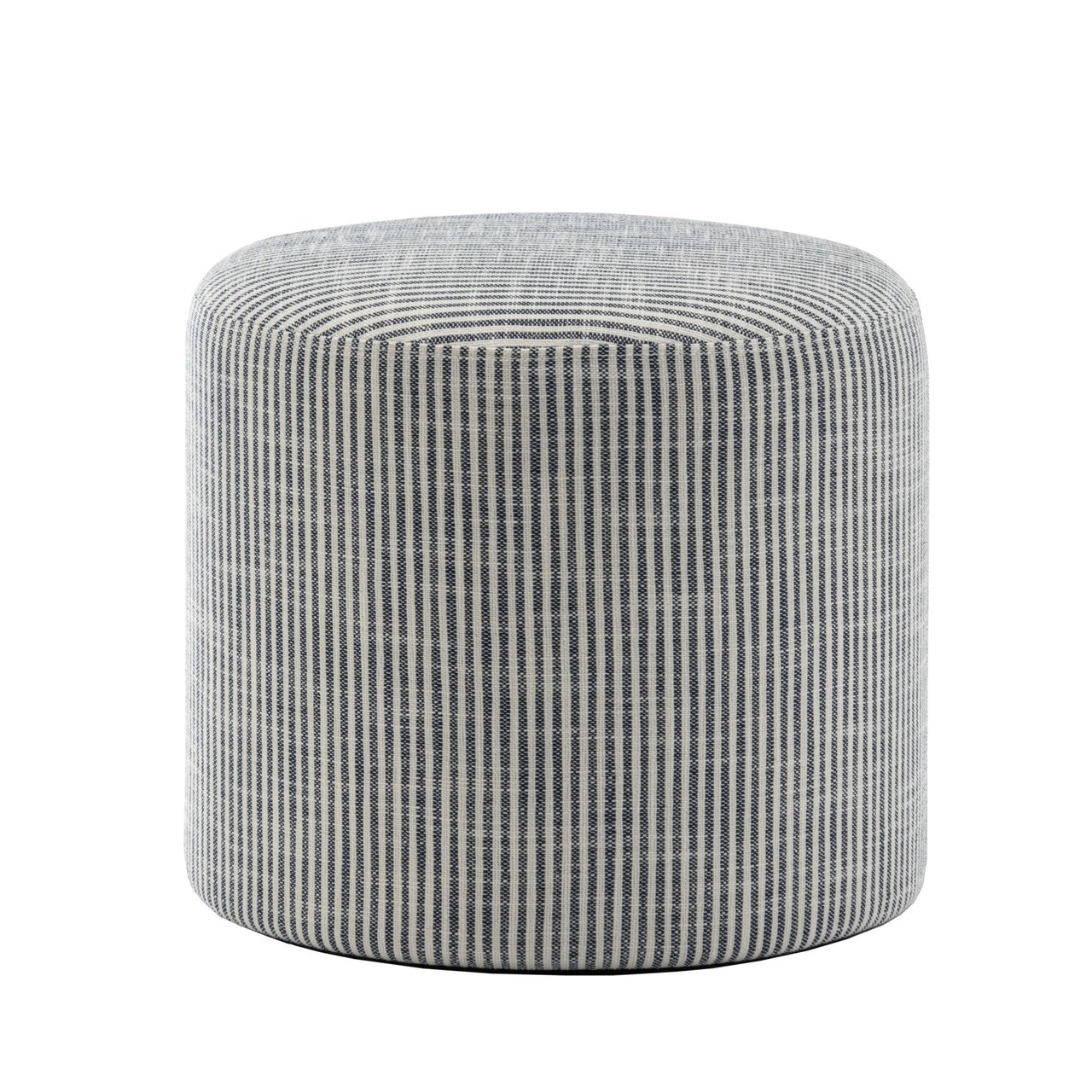
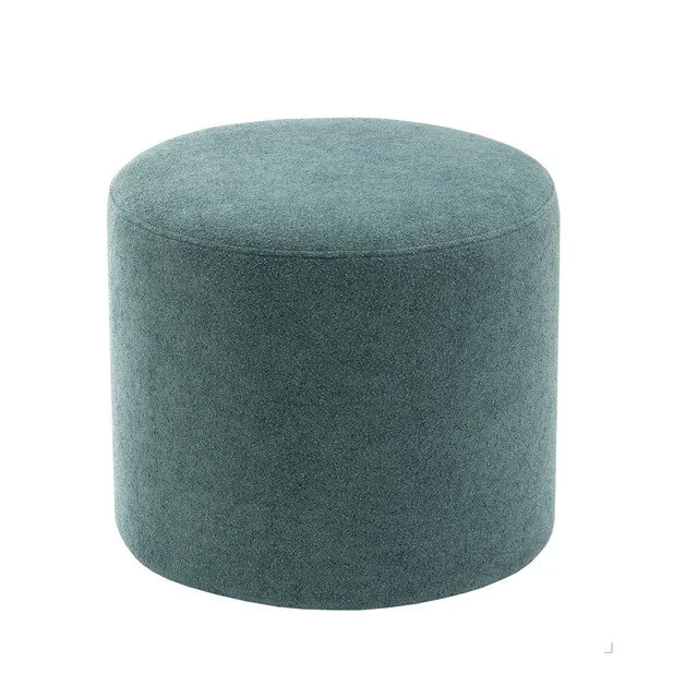
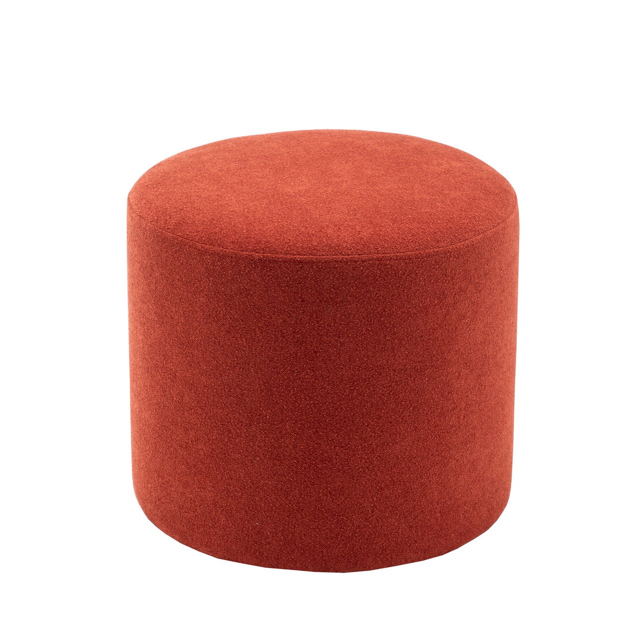
Rebecca Plum of Studio Plum used two Wovenbyrd poufs to create an area for her daughter to eat snacks and work on art projects. Rebecca's daughter had previously been using the coffee table for this purpose, but part of Rebecca's ORC project involved replacing the coffee table with a big leather ottoman. This new sofa console table set up is a major improvement—the Wovenbyrd poufs are the perfect height for this table, they look beautiful and don't obstruct the view of the room, they're SO comfy, and they’re light enough to be easily moved and used as extra ottomans if needed.
VIA BROOKE PAVEL
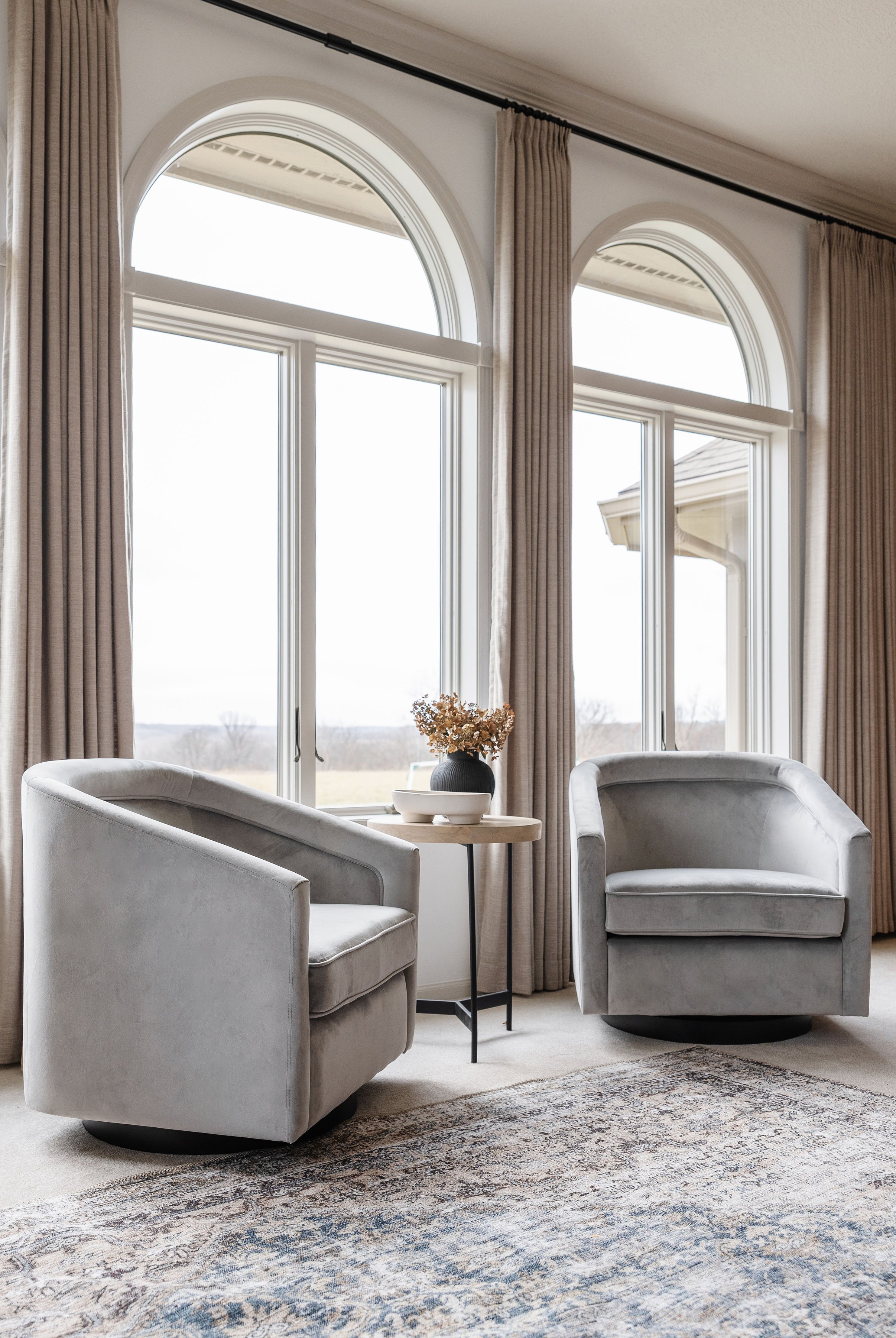
When Brooke Pavel redid her family room for the ORC, she was on the hunt for additional seating that would compliment her sofa and wouldn’t block the view.
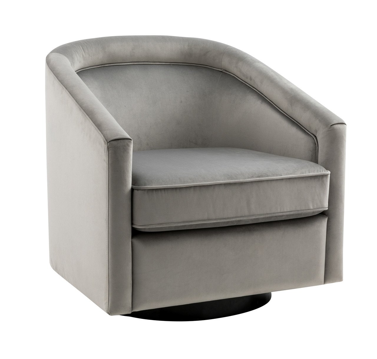
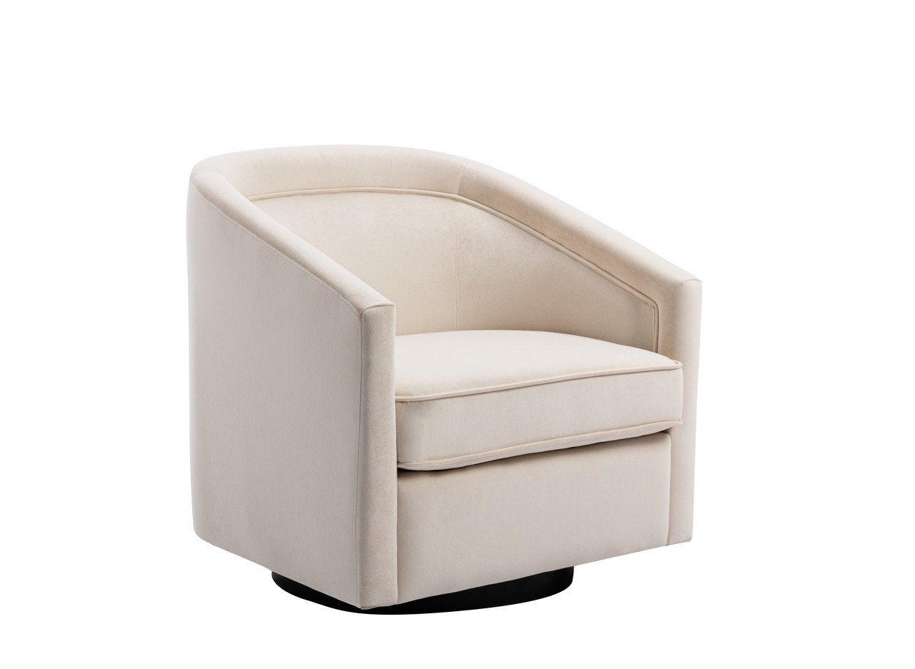
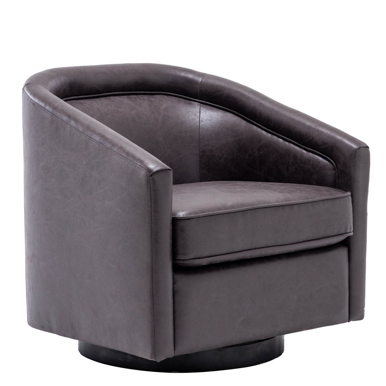
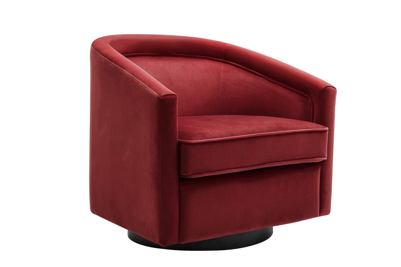
These Wovenbyrd barrel chairs fit the bill perfectly. They’re low profile so they don’t obstruct any of the view or natural light, and they’re so stylish that together with the big, beautiful windows, they create such a wow moment. Brooke was especially thrilled that they swivel, meaning they work for both conversation seating and watching sunsets.
VIA ANGELA BELT
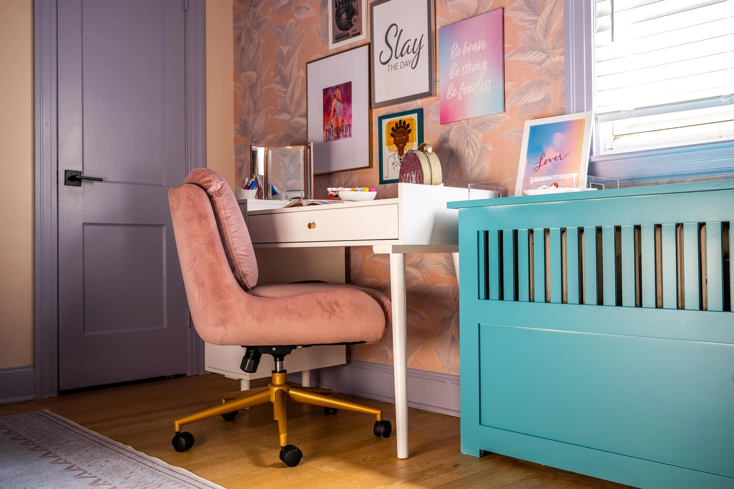
During the spring 2023 ORC, Angela Belt updated her middle school daughter’s bedroom. Her goal for the room was to create a space that reflected her daughter's style and personality and that can grow with her throughout her teenage years.
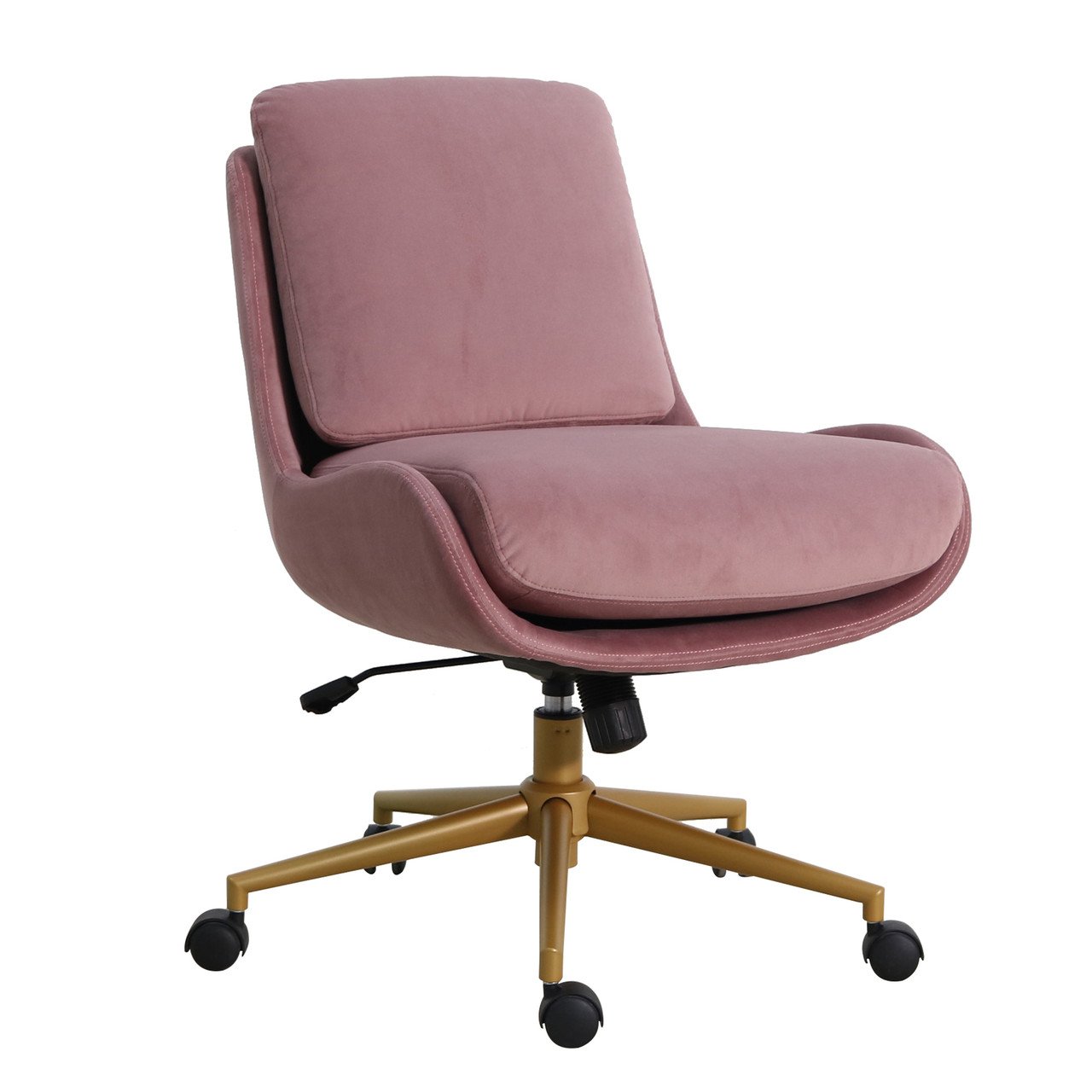
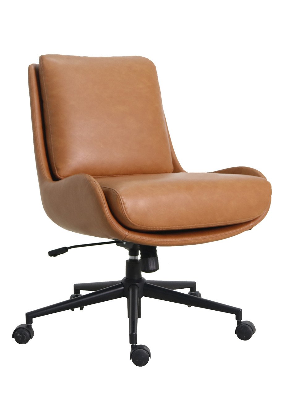
She used this pink velvet Wovenbyrd desk chair as part of her daughter's desk setup. This chair will certainly be a staple of her daughter's room for many years to come. It fits seamlessly with her daughter's style, and we can't imagine a more stylish or comfy spot to get homework done.
Here at One Room Challenge, we're proud to partner with Wovenbyrd and are grateful for their ongoing sponsorship. As the upcoming event approaches, we can't wait to see their gorgeous pieces in new exciting spaces!
Angela and Tyler transformed an 800-square-foot plot into a custom raised-bed garden. The whole project was quite an ambitious DIY undertaking that had us truly running to take notes.
Olaniyi and her husband tackled bringing fresh style and functionality to this space completely DIY, and the finished project has to be a contender for the world’s swankiest basement.
Just as it takes skill to be on the cutting edge of design, it’s no small feat to create a space that blends classic and current, and we think the following 22 rooms are phenomenal examples.
Some homes have a charm you can’t replicate, and Laurie’s vintage Vermont farmhouse is one of them. Her challenge now was to finish renovating the kitchen and breathe new life into the space, without sacrificing any of its historic character.
When it comes to architectural detail in your home, there are a number of key terms you’ll encounter, many of which can be a bit mystifying (looking at you, wainscoting).
A crash course on knowing whether or not that FB Marketplace gem is salvageable, if it's worth the time, and where to begin.
When you think of “warm colors” vs “cool colors,” chances are you imagine a color wheel that’s split in half, with warm colors on one side and cool on the other. End of story, right?
Tracey turned an uninspired laundry room into a gorgeous green space where working on laundry would put anyone in a fantastic mood.
Pattern is absolutely everywhere. Materials like wood and marble technically have a pattern, so even the most devout minimalist still has to balance and mix patterns in their home.
Galley kitchens get a bad rap for being cramped and impractical, but this one is proof that a carefully planned and well designed galley kitchen can be just as gorgeous and functional as other layouts.
Have you ever wondered what other DIYers are listening to while they tackle their latest projects? Team ORC recently launched an extensive research study (a few polls on our Instagram story).
Although Tracy’s (@4009decorates) 11-year-old son’s bedroom was already fantastic, it had a kid-like, playful vibe that he had outgrown. Micah expressed his desire for a more grown-up room that reflected his current interests and personality, or, more specifically, hunting lodge themed decoration and "cool old stuff" (aka vintage finds).
While we may not rely on these cutouts to keep our butter fresh, they still add heaps of charm and whimsy to cabinet fronts.
First time ORCer Mary (@whiskandkeyhome) tackled a very familiar problem during the spring ‘24 event—an uninspiring home office gathering clutter due to lack of storage space.
Husband & wife DIY duo Norman and Iesha set out to clean the dryer vent and ended up with what are quite possibly the world’s most beautiful stock cabinets.
Have you ever happened upon a DIY video while scrolling through your social media feed, and felt a sudden urge to start tackling a new project in your home? Research has shown that watching our peers DIY on social media is like a lightbulb moment.
While her music room was already lovely, Xin was ready to give the space another pass now that she’s a seasoned DIYer.
The recent spring ‘24 ORC was Brielle of Brielle Interiors’ first crack at blogging, DIYing, and ORCing, and she completely knocked it out of the park with this space.