Understanding Warm & Cool Colors, and How to Use Them in Interior Design
DESIGN
STORY BY VIRGINIA BESHEARS
When you think of “warm colors” vs “cool colors,” chances are you imagine a color wheel that’s split in half, with warm colors on one side and cool on the other. End of story, right?
Infuriatingly, many color theory guides don't go beyond “red is warm, blue is cool,” when that’s only a tiny piece of the color temperature puzzle.
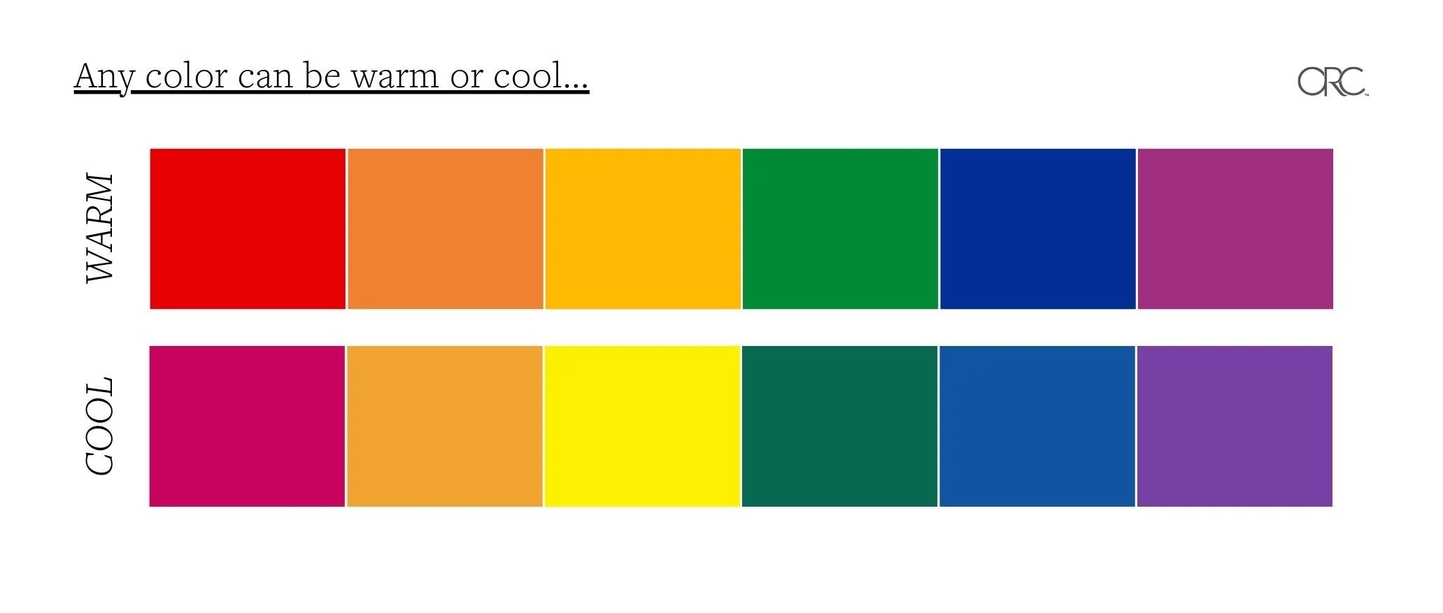
While it’s true that colors inherently lean either warm or cool, every color can have both warm and cool variations. In other words, blue isn't always cool, and red isn't always warm.
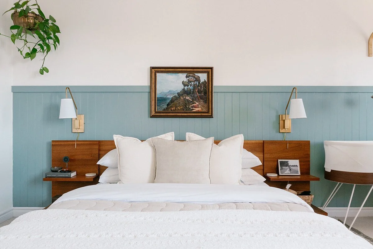
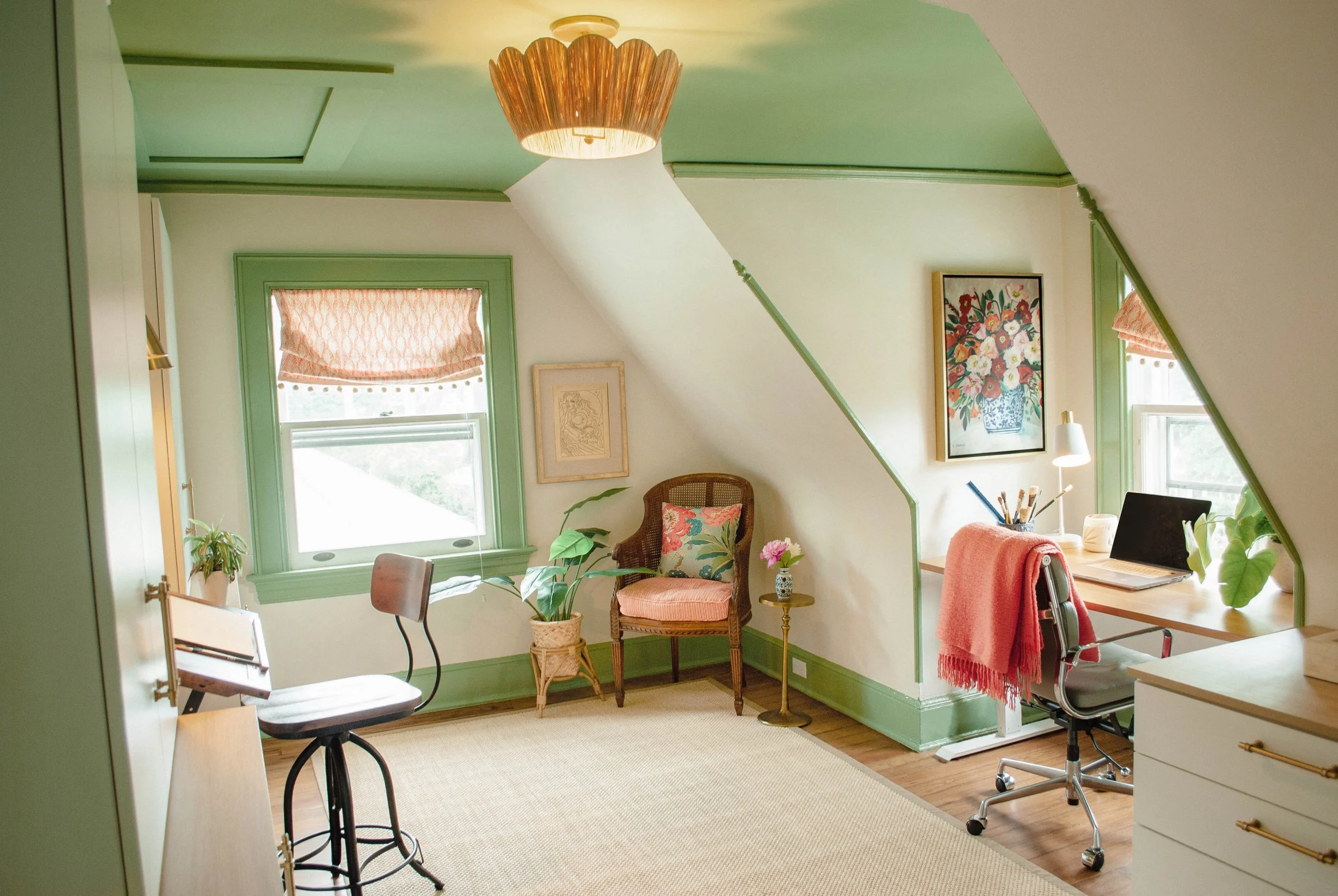
VIA LAVENDER JULEP
What color theory guides leave out
The idea that blue is always cool and red is always warm is a simplistic way to think about color.
Think of the classic split color wheel as the “zoomed out” version of color temperature. The “zoomed in” version is that there are both warm and cool shades of every single color.
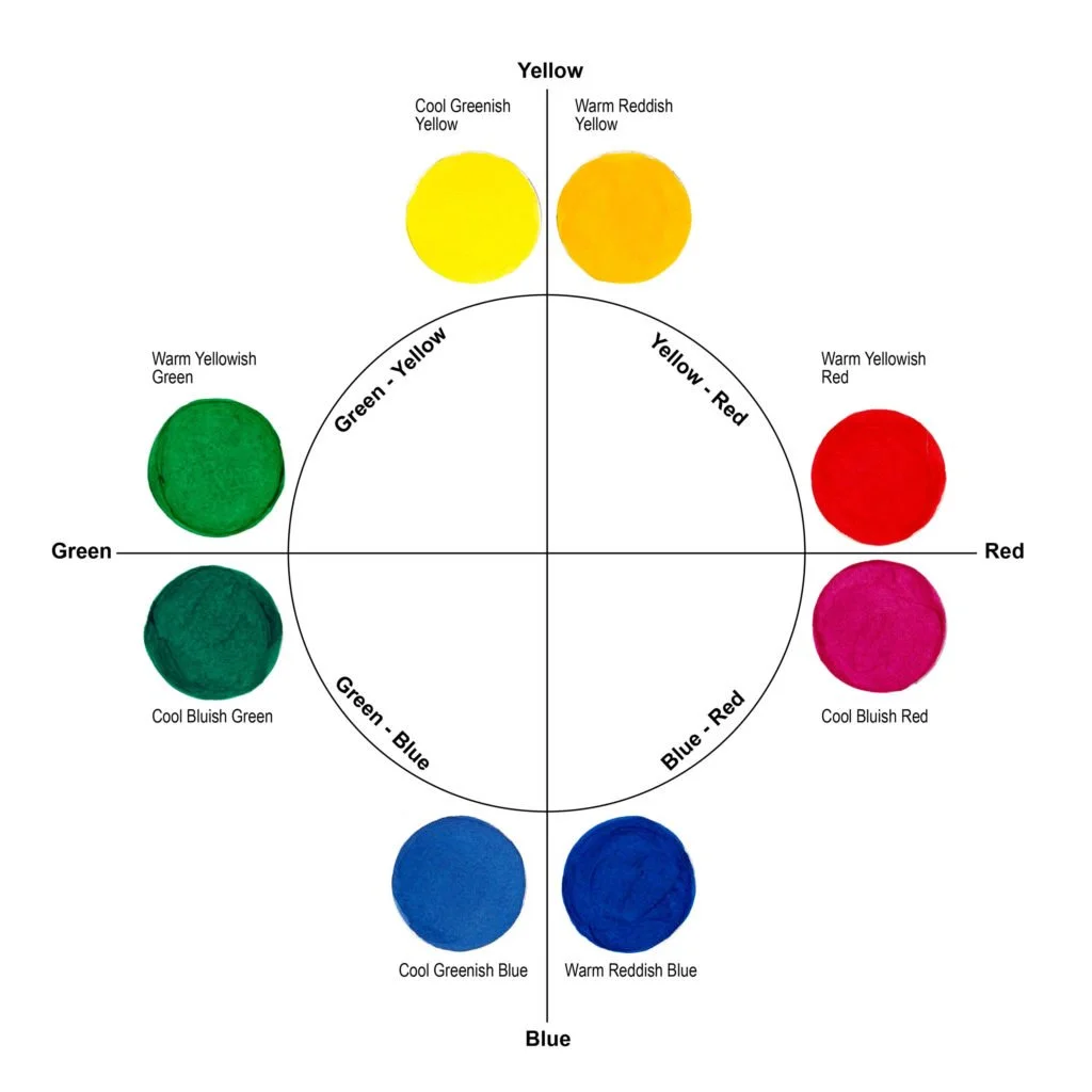
Most colors are very easy to identify as being warmer or cooler. Blue, however, can either have a red bias (blues closer to violet) or a yellow bias (blues closer to green), and since red and yellow are both warm colors, there’s some disagreement about which blues are warmer and which are cooler. Red-bias blues being the warm blues seems to be the majority opinion, and that’s what makes the most sense to me, especially looking at the color wheel, like the extremely helpful color wheel below from JustPaint.
How to use warm & cool colors in interiors
The best interior designs often incorporate both warm and cool colors to create depth and contrast. Too much of one type of color can make a room feel flat and one-dimensional. The key is to create balance.
You can also layer different shades of the same color to play with the balance between warm and cool. For example, using multiple shades of blue—from a deep, cool navy to a warmer, softer teal—can add depth and interest without overwhelming the room with too many contrasting colors.
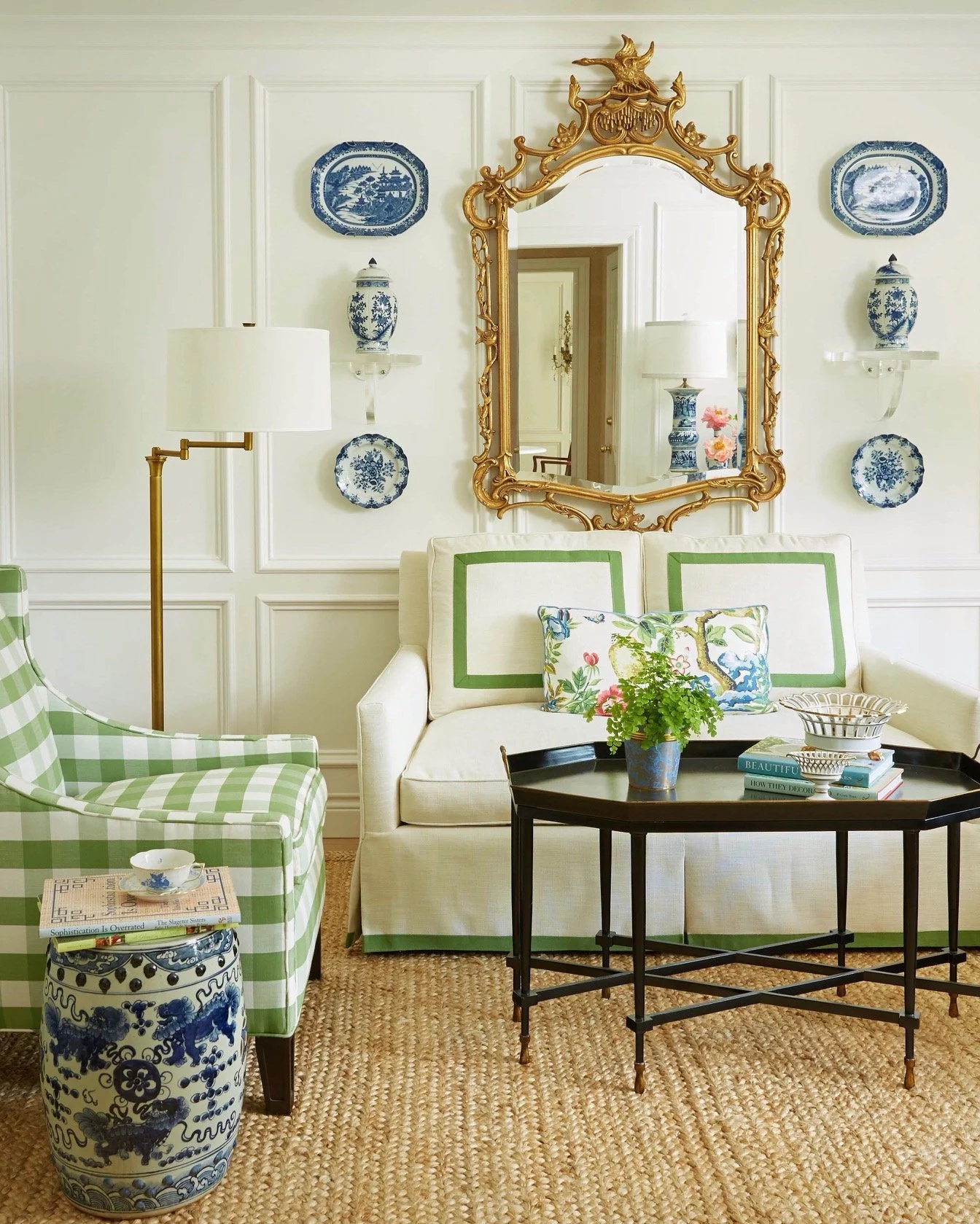
VIA THE PINK PAGODA


To pull all that color theory info together, check out the two moodboards above. The one on the left is mostly a mix of cool & warm blues, with cool accents in the metals, and a little warmth in the plants. The one on the right is still primarily the cool & warm blues, but with warm wood mixed in, and warm brass hardware.
Neither moodboard is “correct,” and both rooms would be lovely in real life. However, there is quite a big difference in the overall vibe of each—the left feels more serene and spa-like, and the right feels much cozier and lively. How much cool and warm you incorporate will ultimately depend on what vibe you’re going for.
In the end, it’s all about balance and personal preference. Understanding color theory will help you achieve your design goals with confidence.