Why Your Guest Bedroom Is the Perfect Space to Make Over
Why Your Guest Bedroom Is the Perfect Space to Make Over
Need proof? Check out these five One Room Challenge results.
STORY BY ALLISON GOLDMAN PHOTO BY MOLLY HARDIN
Raise your hand if you have a guest bedroom that’s really more of a dump-everything-we-don’t-have-a-spot-for room. Lots of people, right? That’s exactly what makes guest bedrooms such perfect targets for One Room Challenges: They have lots of room for progress — literally. Here are five examples that show off the potential.
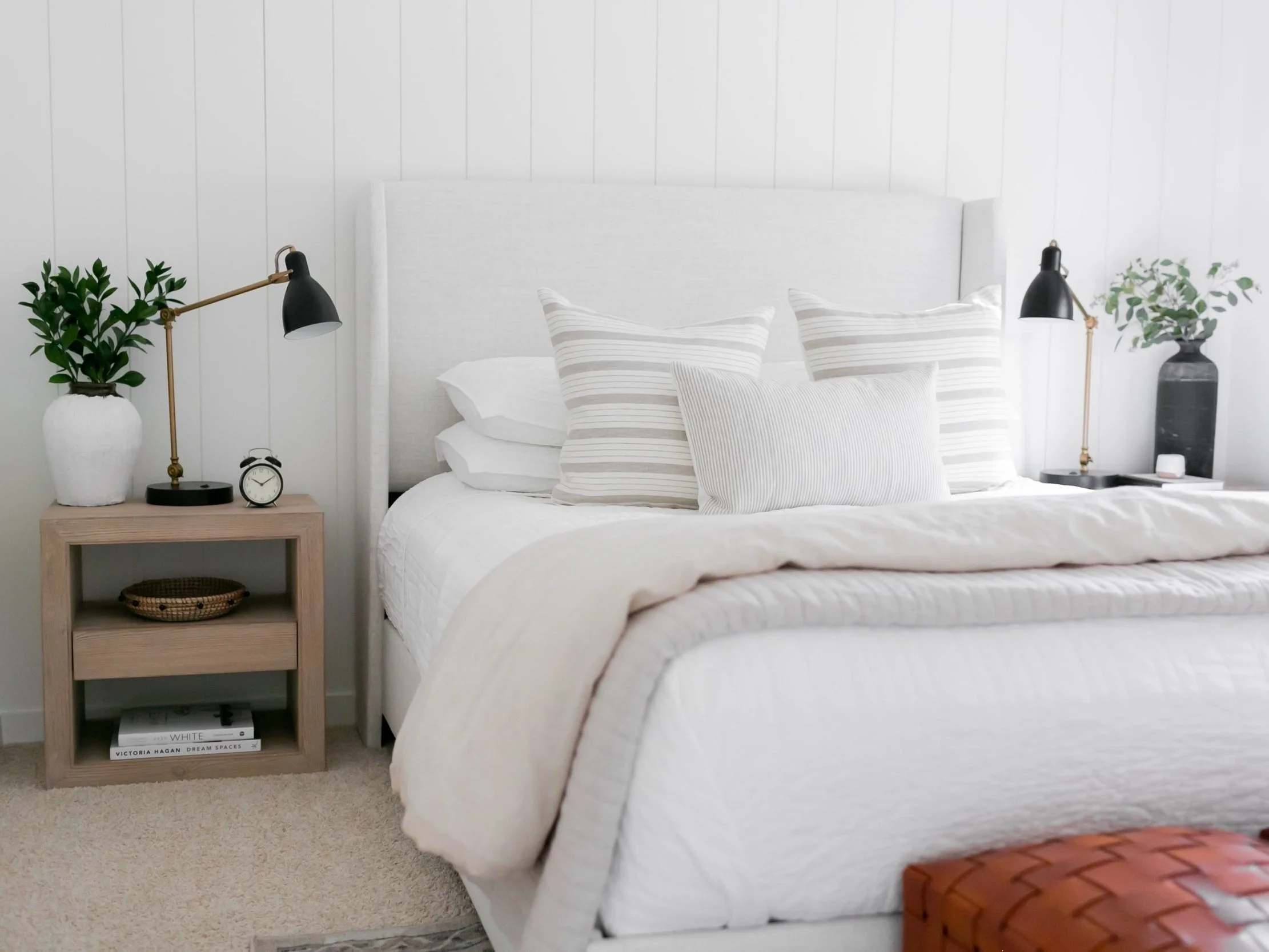
Why did Kaari Sommer choose her guest bedroom for her first One Room Challenge? “Because previously it was being used as basically a storage room with a bed in the middle of it,” she says. “We live in a small home, so I walked by it several times a day, and it was driving me nuts.” It’s now a bright and calming space with some seriously cool woven leather ottomans from McGee and Co.
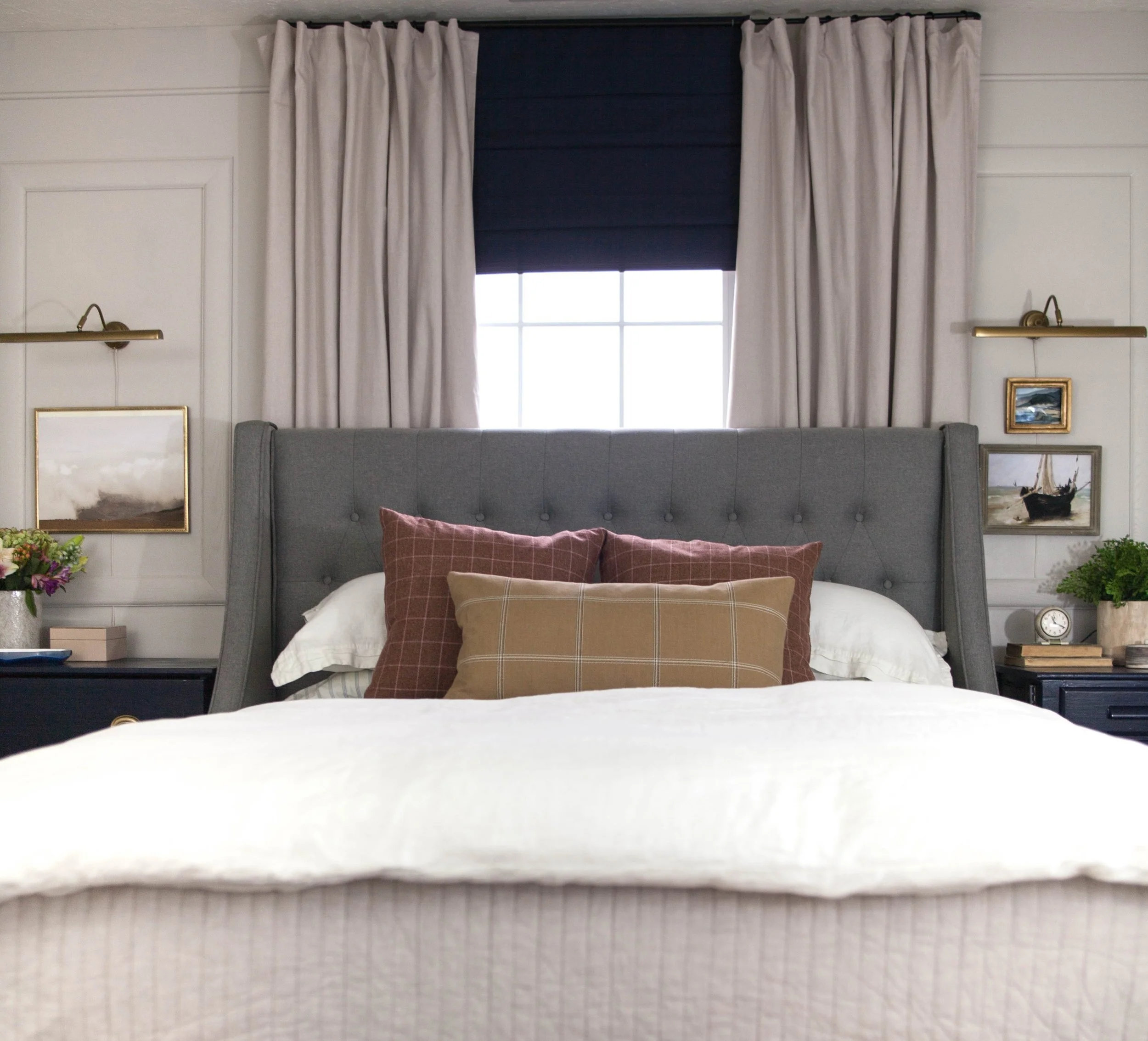
Where plaid meets botanical
PHOTO CREDIT Rambling Renovators
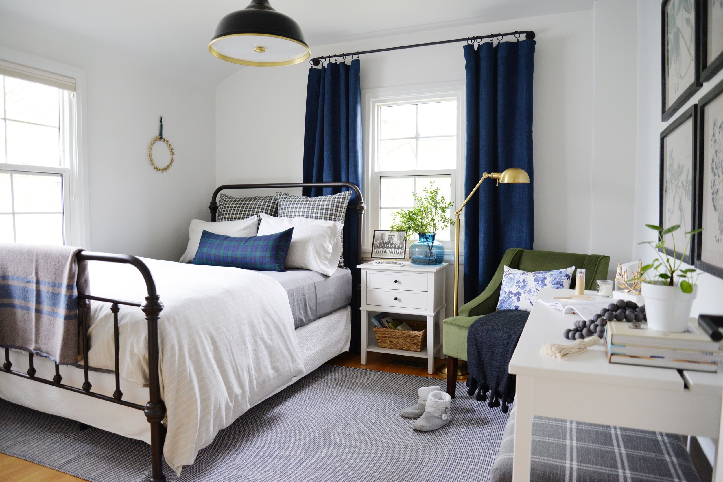
“Some people have a junk drawer… This became a junk room, and we used it to store extra furniture, home renovation materials, and anything else that didn't have a home,” explains Jennifer Flores of her family’s guest room. She used the One Room Challenge to “reclaim this space,” she says, transforming it into a cozy, plaid- and botanical-accented destination. “It went from ignored to one of our favorite spaces,” she says.
Texture, texture
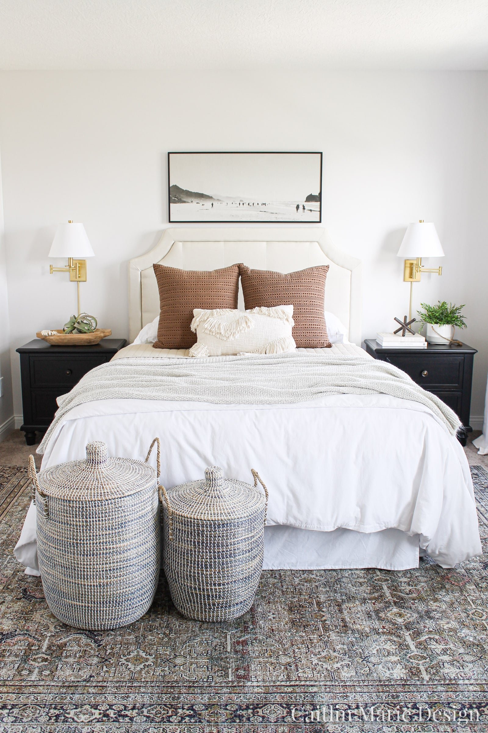
Caitlin felt like her guest room was, well, totally fine. But she also felt like “my style had evolved since we moved into our home, and I wanted to create a high-end look on a budget,” she says. So she added a little bit of color and a whole lot of texture to the room to achieve the “cozy and welcoming” feel she was going for.
Wooden molding and warmth
Angela Lerew focused on her family’s guest bedroom because it “was a hodgepodge of furniture, and the closest was a total mess,” she says. (Are you sensing a theme here?) The biggest element she eliminated was a faux brick wall, replacing it with wooden molding and adding fabrics and details in jewel-toned hues.
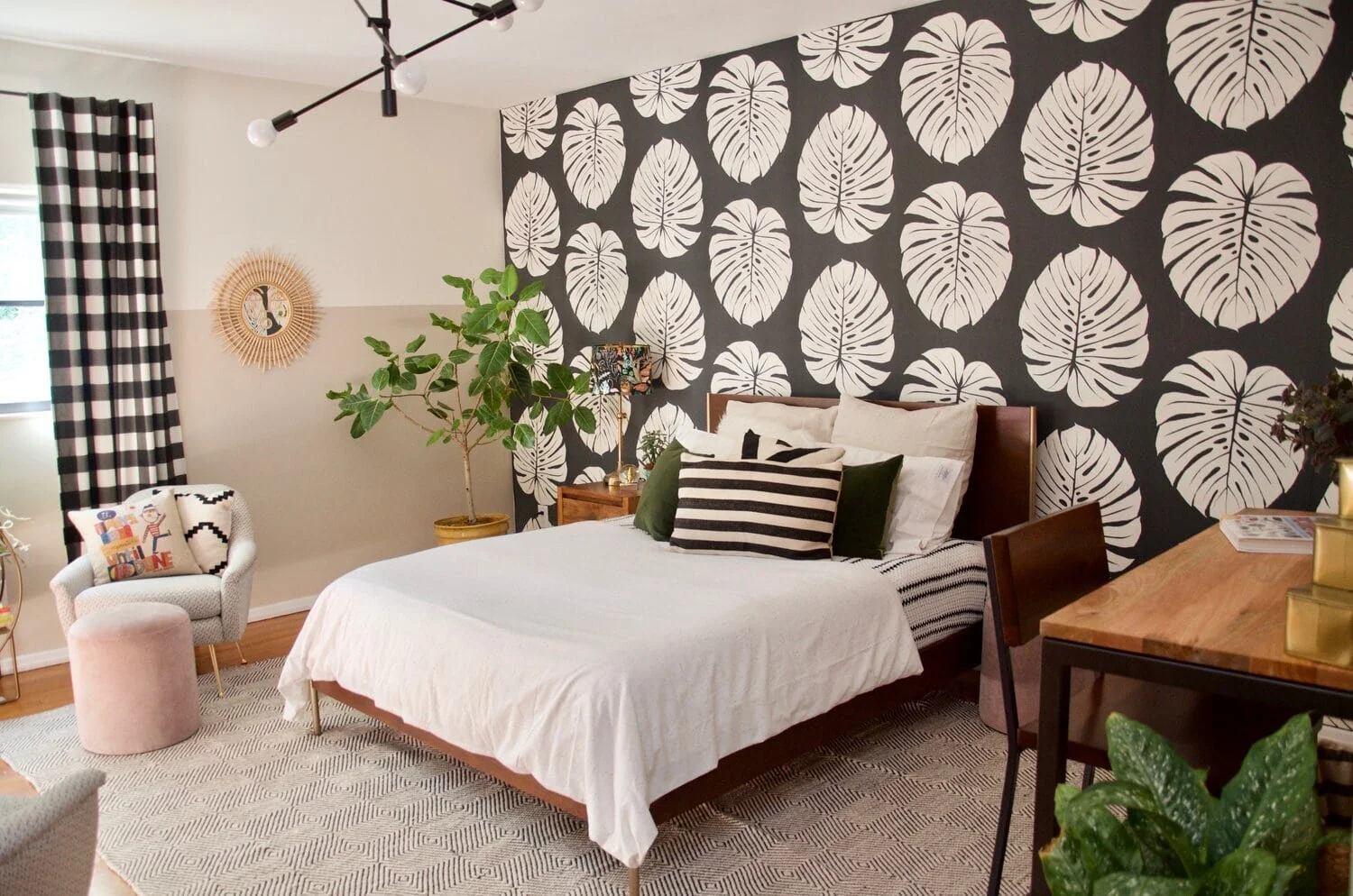
Bold monochrome
PHOTO CREDIT Molly Hardin
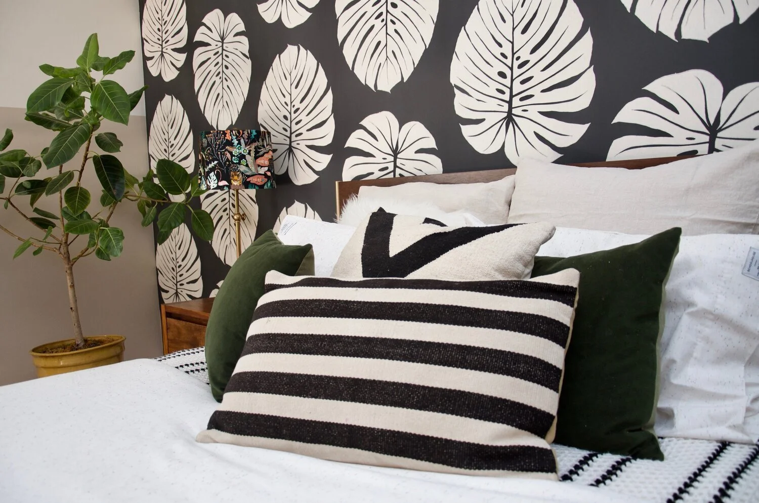
After Molly Hardin’s family moved into her 1960s fixer-upper five years ago, they started using this spare room as a catchall. “When a piece of hand-me-down furniture would be replaced, it would go in this room, just in case we needed it again,” she says. “It eventually became a room full of mismatched pieces that were not serving our family and were not going to be incorporated into the design of our home.” She wanted to create a place for her five young kids to chill out, “a space that was monochromatic like the rest of my home, but with soft pops of color to make it inviting for my kids,” she explains. “[Now] it’s a bright and sunny space that the whole family enjoys.”

