B&A: Unbelievable Builder Basic Kitchen Transformation
BEFORE & AFTER
VIA KRISTIN LAING
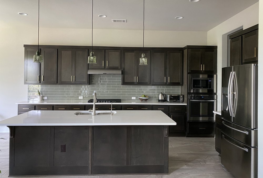
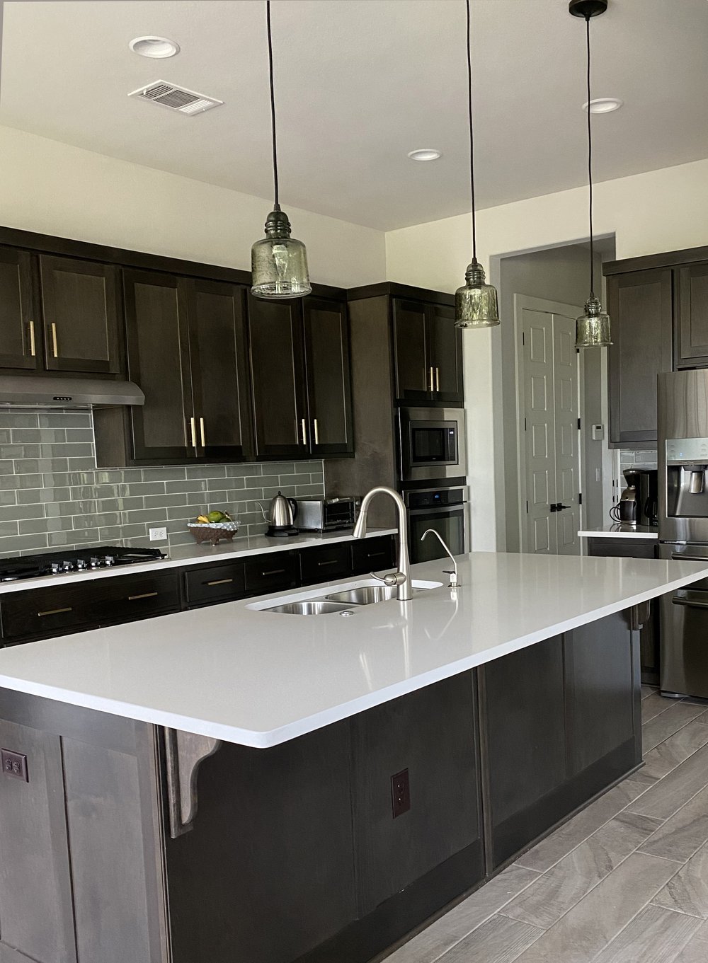
This stunning kitchen transformation is by Kristin Laing from the spring ‘22 ORC. When she moved into the house a year and a half before the event began, she had already started mentally planning the changes she wanted to make to the builder-basic kitchen. Her goals for the project included creating a focal point, improving storage, lighten and brighten the space, and add some curves to the very rectilinear space.
VIA KRISTIN LAING
Elements of the kitchen that remained unchanged include the tile floor, the island, and some of the cabinets.
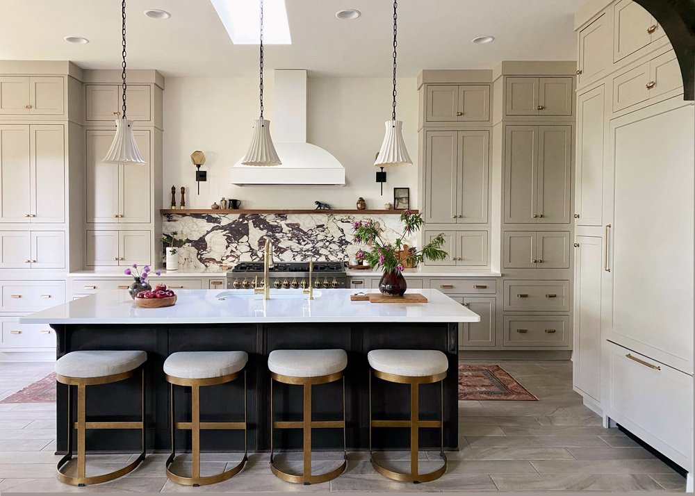
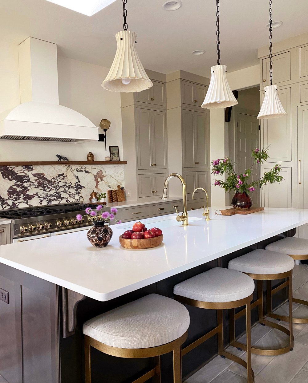
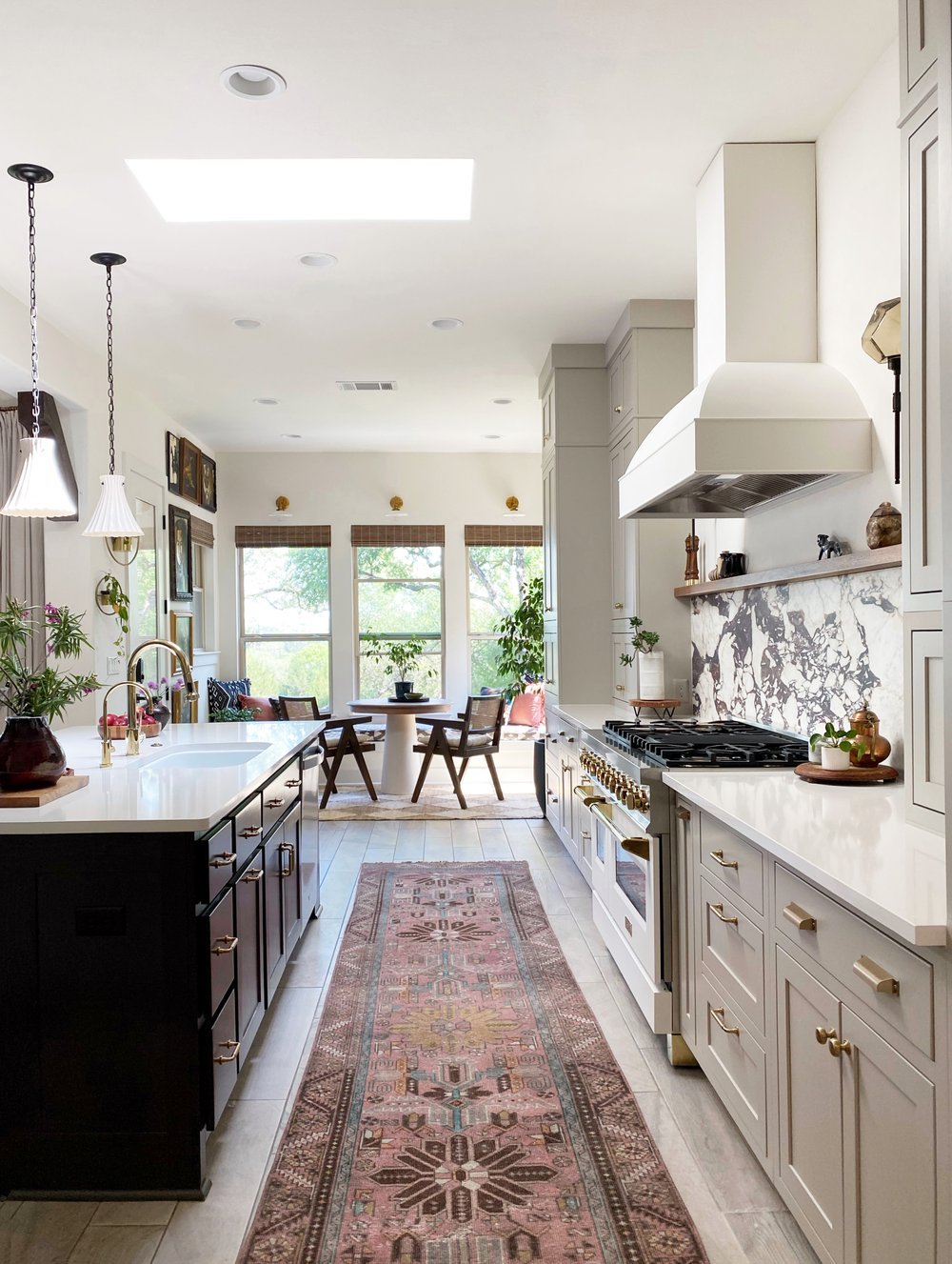
Of all the new elements, that gorgeous honed Calacatta Viola marble backsplash is absolutely one of the most impactful. Kristin’s goal of creating a focal point in the room was most certainly achieved. The wood floating shelf directly above it is such a wonderful touch as well, and provides a spot for accessories that bring character into the room. The beautiful new range hood also brings in some of the curves from Kristin’s goals list.
The cabinet reconfiguration, namely bringing them to the ceiling, is another hugely impactful change. No, the ceilings weren’t raised as part of this renovation— that’s just how much of a difference it makes. The warm neutral paint color is also so lovely and matches the natural, unique feeling of the marble.
Also, could those island lights be any cuter? They add character without being a distraction.
VIA KRISTIN LAING
This gorgeous runner is the cherry on top of this kitchen. Rugs and runners are an underrated way to bring warmth and softness into a kitchen. It’s a wonderful and surprising pop of color that matches the red tones in the marble.
The updated kitchen also flows seamlessly into the breakfast nook and the whole space feels incredibly cohesive and stylish.
It’s absolutely amazing how rich and full of personality this once-builder-basic kitchen now has!
We want to feature your amazing before & afters! Send us photos or videos from your One Room Challenge® project via this form.
Virginia from Team ORC tackled a mini project during the fall event. The catalyst for this project is named Clancy.
Some of the most satisfying home improvements are the tiny ones that take less than an hour but somehow never make it to the top of the to-do list.
Last week, on the very first day after the time change, I could already feel myself getting sluggish and blah as the sun started setting at 5:30pm. This year, I'm deciding to be proactive and set myself up for success, and I've learned some genuinely interesting stuff that I'm sharing here.
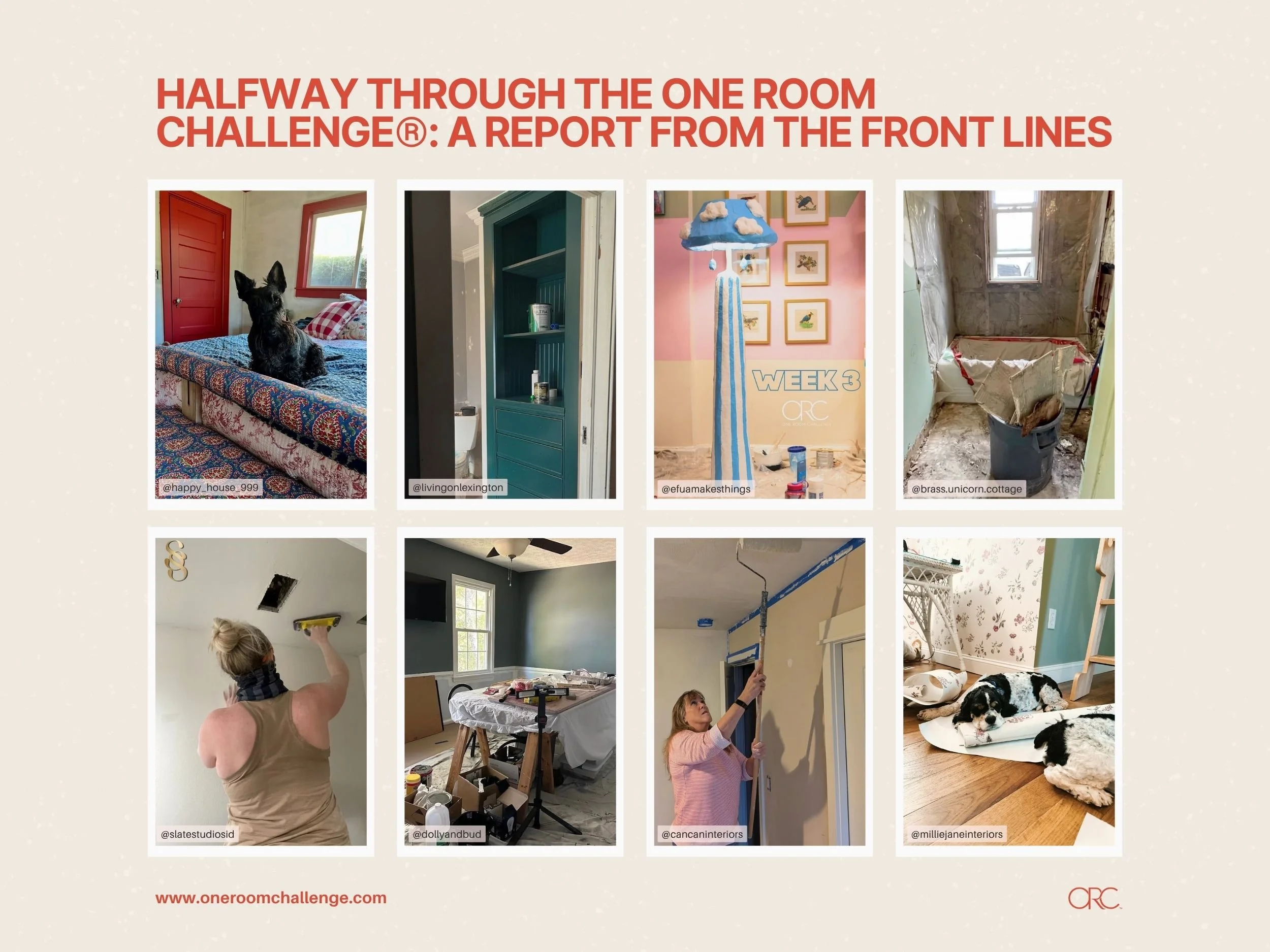
We're officially halfway through the fall '25 ORC, and wow, what a season it's shaping up to be! We've been absolutely loving watching everyone's progress unfold. In case you missed the first few weeks, here are just a few of the MANY highlights from this season so far.
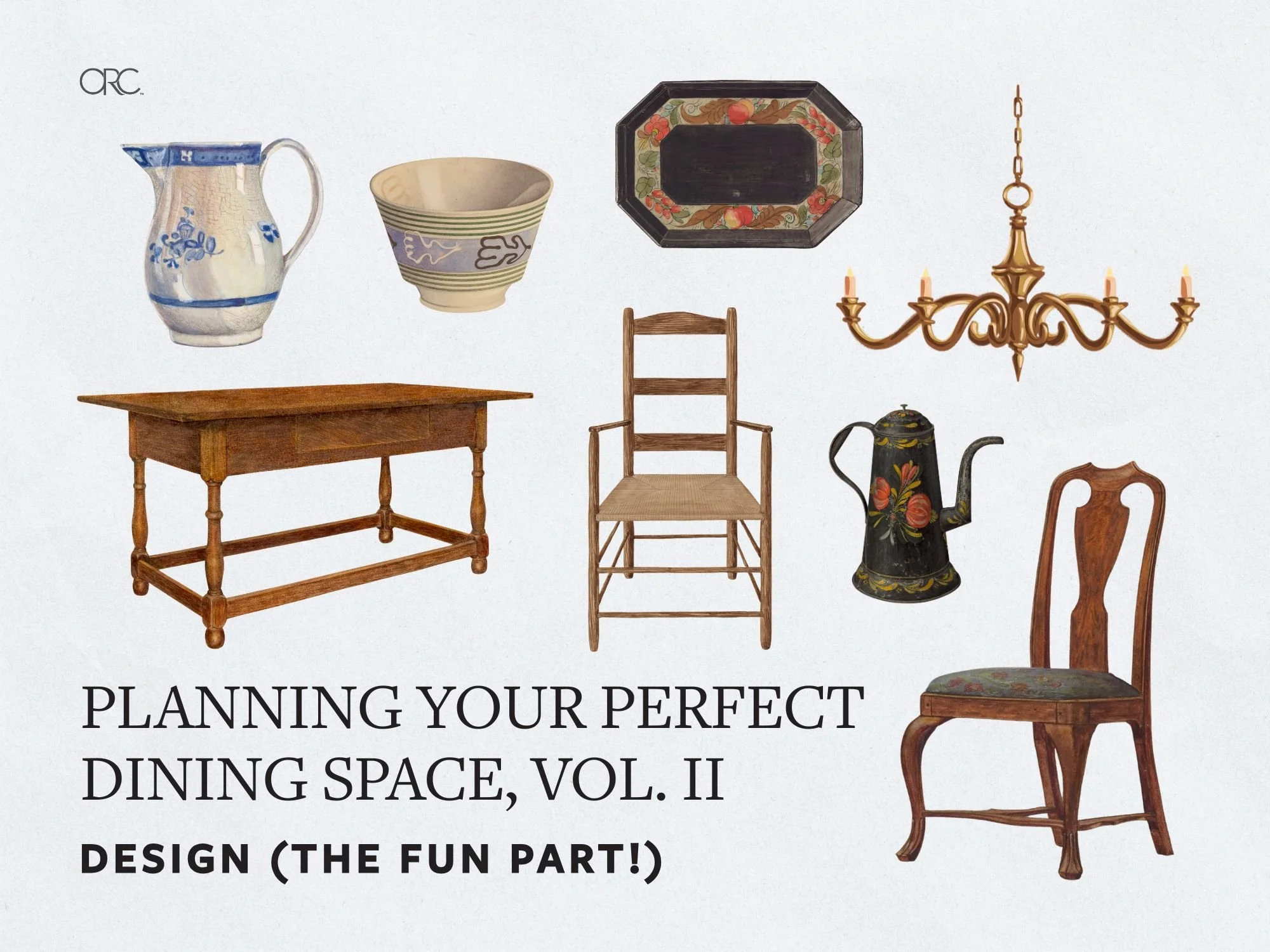
Welcome back, now comes the fun part! It's time to use design to finish creating a dining space you'll enjoy. The aesthetic choices you make should support and enhance the functional plan you created in Part 1.
If your Instagram feed is anything like ours right now, you're probably drowning in jaw-dropping fall vignettes that look like they took a full weekend (and a small fortune) to create. Not everyone has Martha Stewart's budget or her team of stylists, though, and that's absolutely okay.
As we head into October and November, we're sharing our strategy for bringing seasonal charm into your home in an economical, thoughtful, and refreshingly low-effort way.
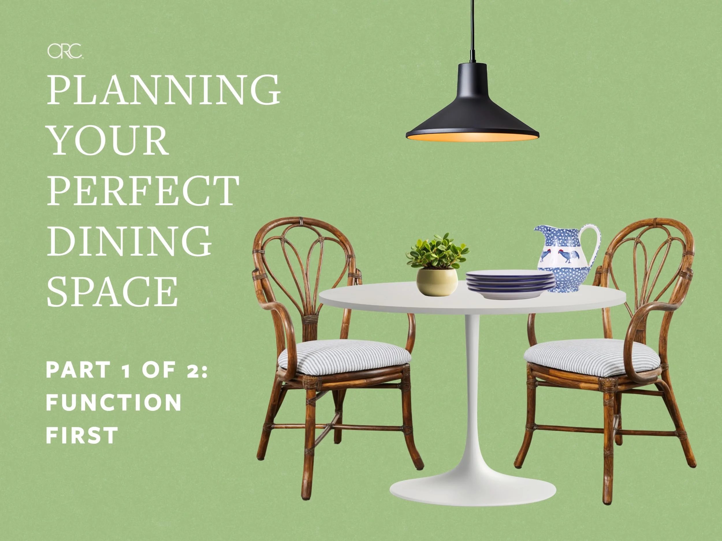
When it comes to creating a dining space, the most crucial (and the oft skipped) step of the process is figuring out how you actually live and how the space where you eat can fit or enhance your existing routines.
It is SO tempting to jump straight into decor, but unfortunately even the most beautiful dining room in the world won't serve you well if it doesn't match how your family actually eats, entertains, and uses the space.
When it comes to window treatments, there's an overwhelming number of options available, each with its own benefits and best-use scenarios. Let's break down every major type of window treatment, when to use each one, and how to choose what's right for your space.
Luckily, you don't need to learn a bunch of technical terms. You just need to know which paint works for your project so you don't have to repaint your kitchen cabinets in six months. Let's figure out paint together, shall we?
You might discover, like I did, that a handful of well-chosen smart devices can quietly handle life's little annoyances without turning your home into a complicated tech project.
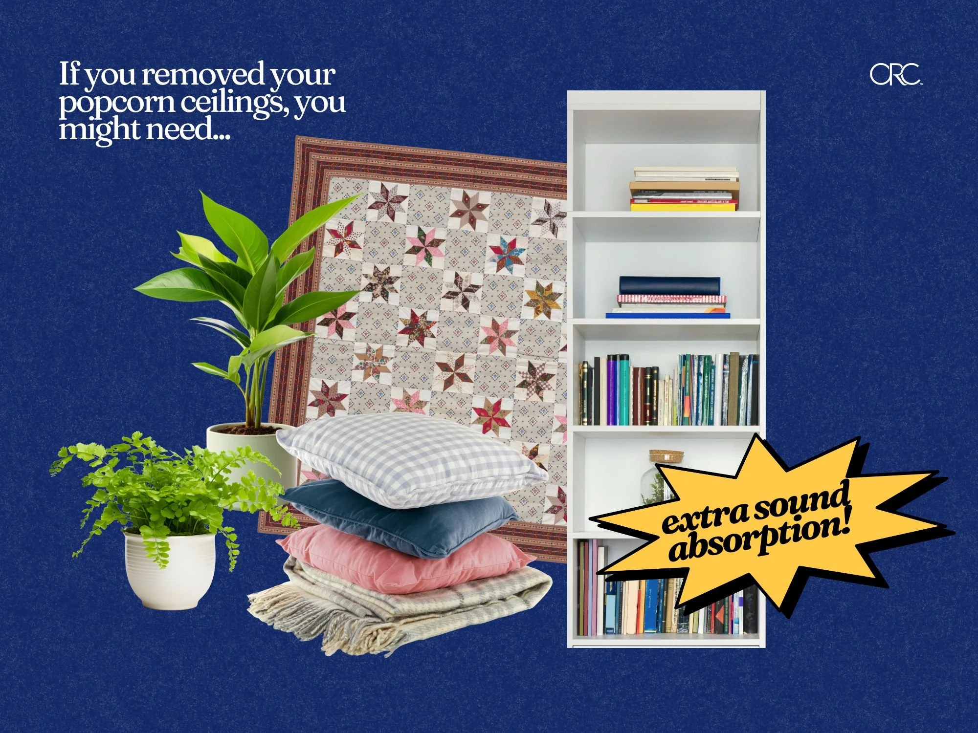
Although I'm staunchly anti-popcorn ceiling, I am willing to admit that they have exactly one thing going for them: their sound dampening ability.
The past few decades of interior design trends have indeed been steering us towards an acoustic nightmare, trading the sound-absorbing qualities of our homes for sleeker, shinier hard surfaces.
If your home has a bad case of “boring hallways,” fear not! There are so many ways you can make them feel just as special as every other room.
We were so excited to see so many community members interested in tackling mini projects. With help from ORC folks on Instagram, we’ve put together this mini project guide that should answer any questions and give you lots of ideas.
Think you don’t have space for a garden? Think again. Container gardening makes it possible to grow flowers, herbs, and even vegetables just about anywhere—balconies, patios, windowsills, or tucked into a corner of your yard.
Looking to go green? Green continues to be one of the most versatile and beloved colors in interior design. There are so many gorgeous shades, though, that it can be difficult to know where to begin choosing the best green for your space.
Creating faux wallpaper with a stencil and paint is drastically cheaper than wallpaper, and it’s completely customizable. If your interest is piqued, here’s what to consider before you start.

