B&A: The Kitchen Transformation with Floorboards on the Ceiling
BEFORE & AFTER
VIA MURPHY DEESIGN
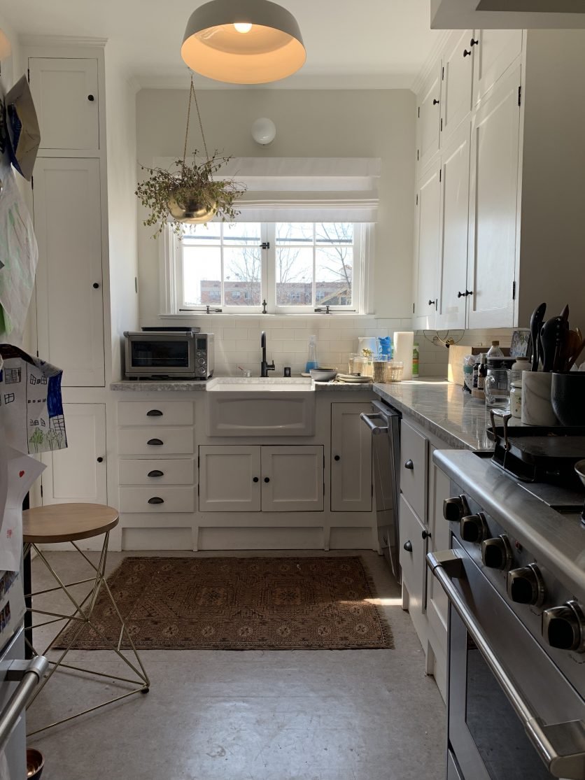
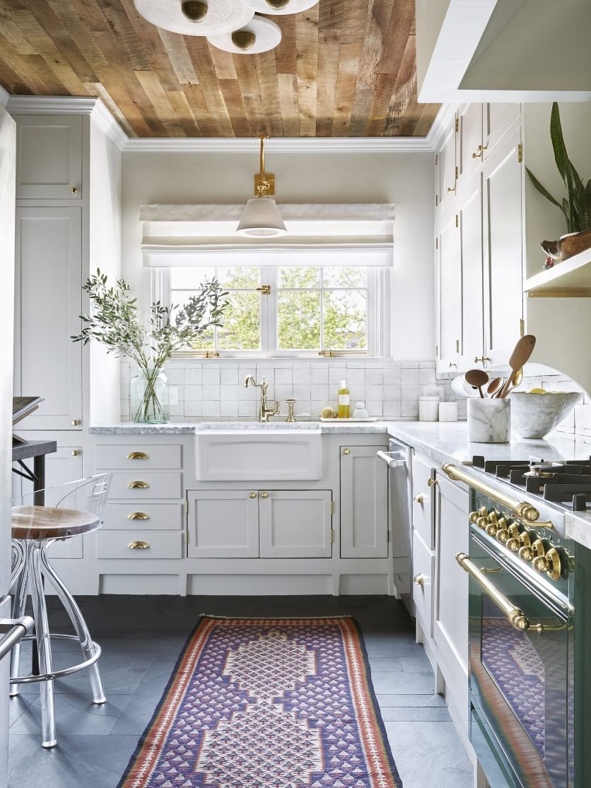
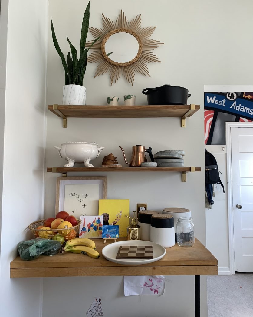
This incredible kitchen is by Murphy Deesign from the spring ‘19 One Room Challenge® event.
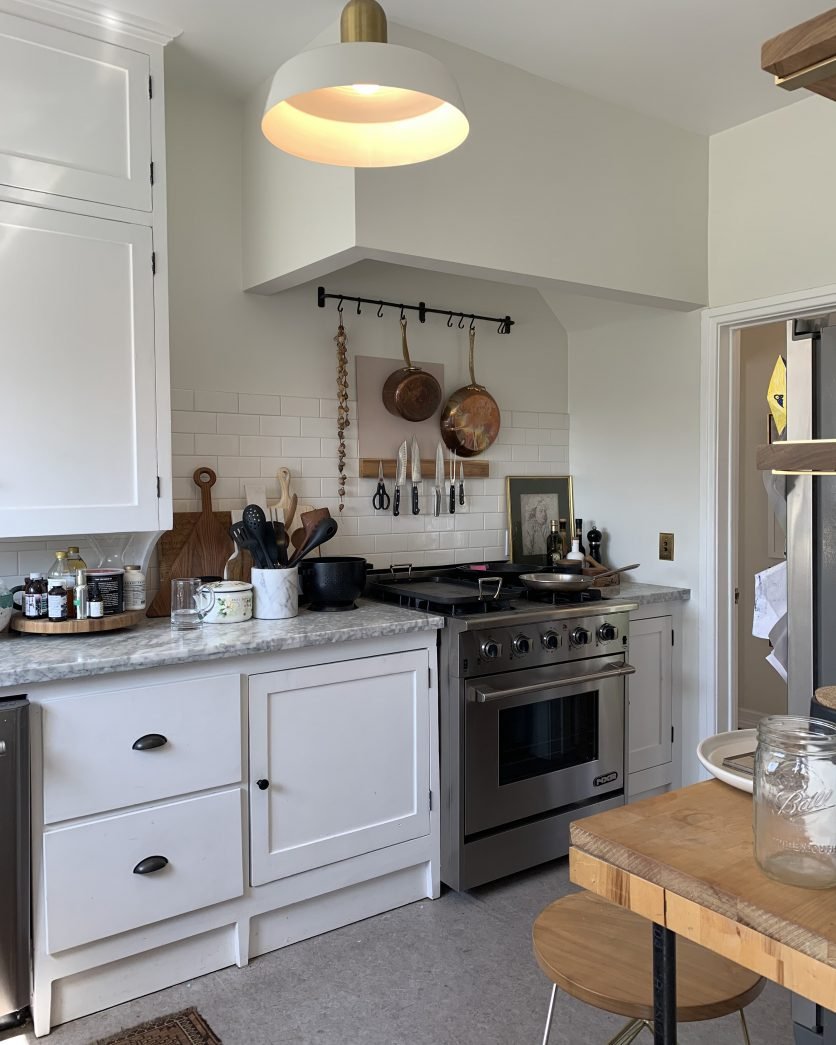
Some major elements stayed the same, like the cabinets, countertops, sink, and window treatment— if it ain’t broke don’t fix it. The changes Dee did make take this kitchen to a whole new level.
VIA MURPHY DEESIGN
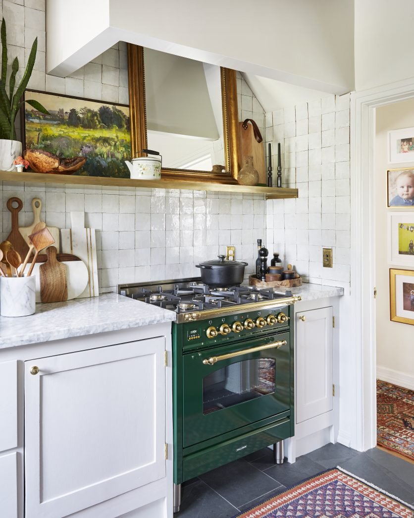
Man oh man, that green range is to die for.
Two other major changes are the Zellige tile and the slate floor. The rug on the slate floor looks gorgeous and really warms it up. The new brass hardware also brings some great warmth into the space.
VIA MURPHY DEESIGN
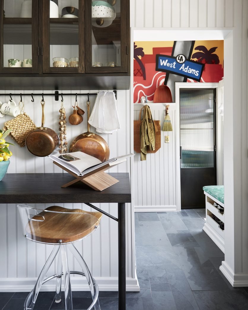
The new beadboard paneling gives this desk nook so much flair and charm. The beadboard peeking out through the upper cabinet is such a great detail.
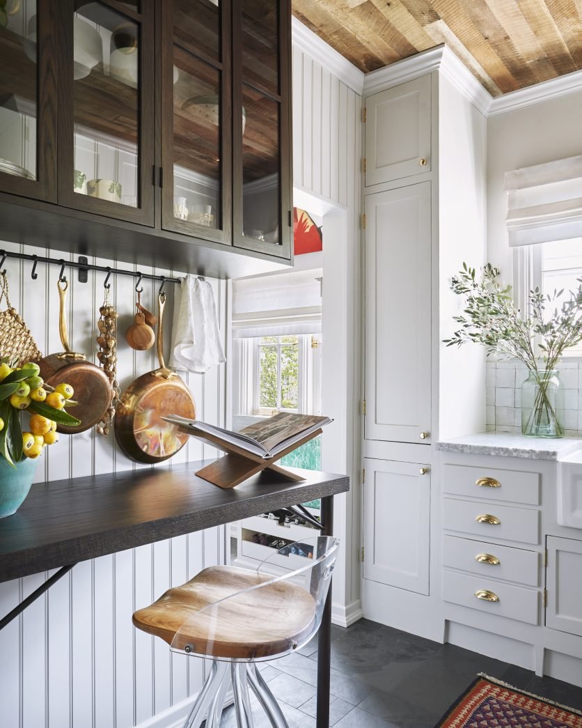
VIA GATHERED LIVING
And, of course, how could I not mention the jaw-dropping unfinished oak on the ceiling? It brings so much warmth and character into the space.
We want to feature your amazing before & afters! Send us photos or videos from your One Room Challenge® project via this form.
If your home has a bad case of “boring hallways,” fear not! There are so many ways you can make them feel just as special as every other room.
We were so excited to see so many community members interested in tackling mini projects. With help from ORC folks on Instagram, we’ve put together this mini project guide that should answer any questions and give you lots of ideas.
Think you don’t have space for a garden? Think again. Container gardening makes it possible to grow flowers, herbs, and even vegetables just about anywhere—balconies, patios, windowsills, or tucked into a corner of your yard.
Looking to go green? Green continues to be one of the most versatile and beloved colors in interior design. There are so many gorgeous shades, though, that it can be difficult to know where to begin choosing the best green for your space.
Creating faux wallpaper with a stencil and paint is drastically cheaper than wallpaper, and it’s completely customizable. If your interest is piqued, here’s what to consider before you start.
Having an office space that energizes you and makes you feel inspired can be such a game changer.
Whether you prefer a bold space that excites you or a more neutral space that makes you feel calm and focused, there’s no better place to work than one that makes you happy.
As 2025 kicks off, our feeds have been wall-to-wall trend forecasts. The trend we’re rooting for the most this year, though, has been ongoing for years now, and has been embraced most widely by none other than Gen Z.
There’s no one-size-fits-all method for organizing your kitchen and pantry, but there is a right way, which is the way that works best for your daily cooking and cleaning routine.
Bathrooms, being small and functional spaces, have precious few ways to bring in pizazz.
Angela and Tyler transformed an 800-square-foot plot into a custom raised-bed garden. The whole project was quite an ambitious DIY undertaking that had us truly running to take notes.
Olaniyi and her husband tackled bringing fresh style and functionality to this space completely DIY, and the finished project has to be a contender for the world’s swankiest basement.
Just as it takes skill to be on the cutting edge of design, it’s no small feat to create a space that blends classic and current, and we think the following 22 rooms are phenomenal examples.
Some homes have a charm you can’t replicate, and Laurie’s vintage Vermont farmhouse is one of them. Her challenge now was to finish renovating the kitchen and breathe new life into the space, without sacrificing any of its historic character.
When it comes to architectural detail in your home, there are a number of key terms you’ll encounter, many of which can be a bit mystifying (looking at you, wainscoting).

