B&A: Dark Kitchen Goes to Bright and Charming
BEFORE & AFTER
VIA SARAH GUNN
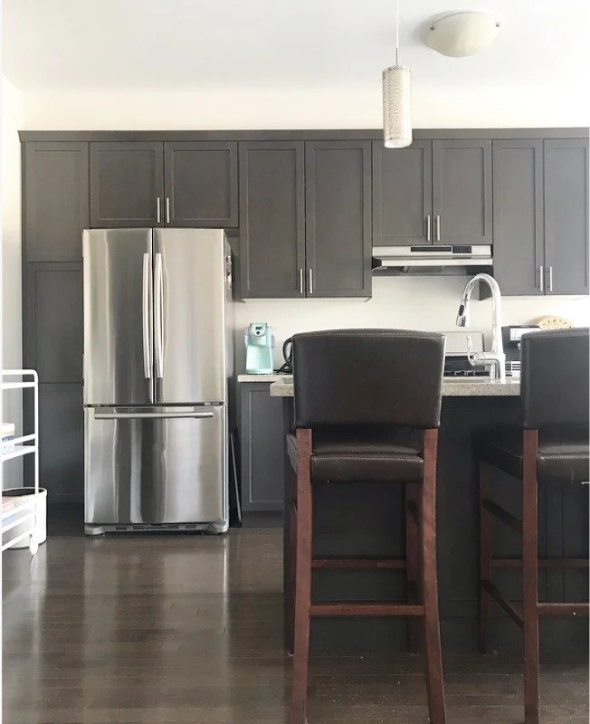
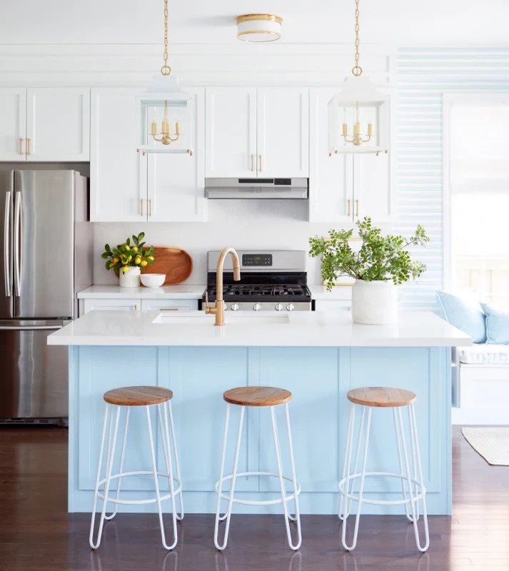
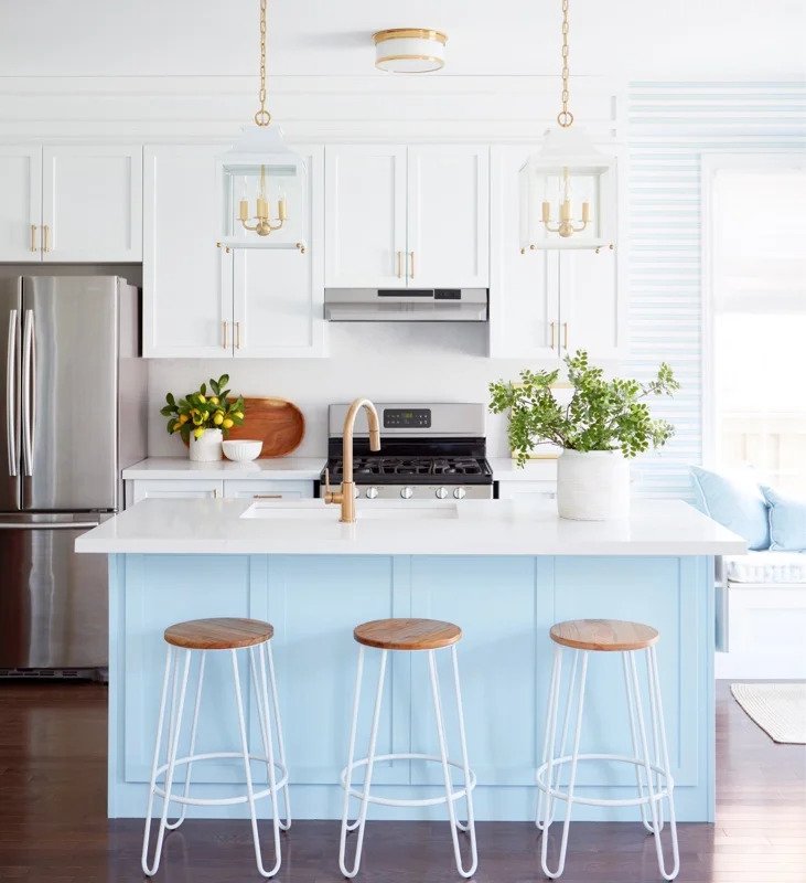
This amazing open-concept kitchen transformation is by Sarah Gunn from the spring ‘19 One Room Challenge® event. She started with a great but generic base, and really made it her own without doing any demolition at all. The lovely light blue paint on the island gives the space a big splash of personality. Also, check out those great light fixtures.
VIA SARAH GUNN
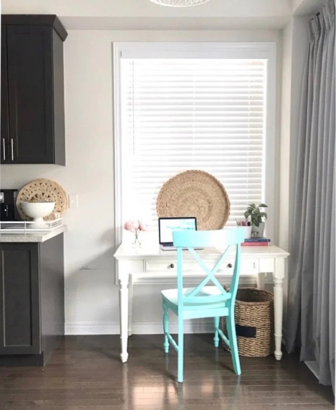
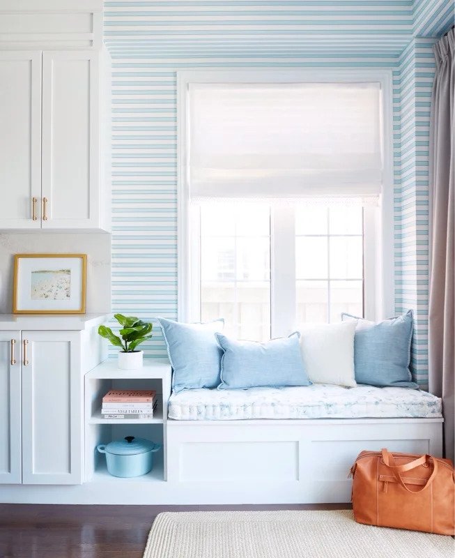
This rarely-used desk was transformed into a very inviting window seat, which Sarah built herself. She also designed the wallpaper herself after not being able to find any that matched her vision.
VIA SARAH GUNN
The finished product is an absolutely lovely and charming kitchen that reflects Sarah’s style!
We want to feature your amazing before & afters! Send us photos or videos from your One Room Challenge® project via this form.
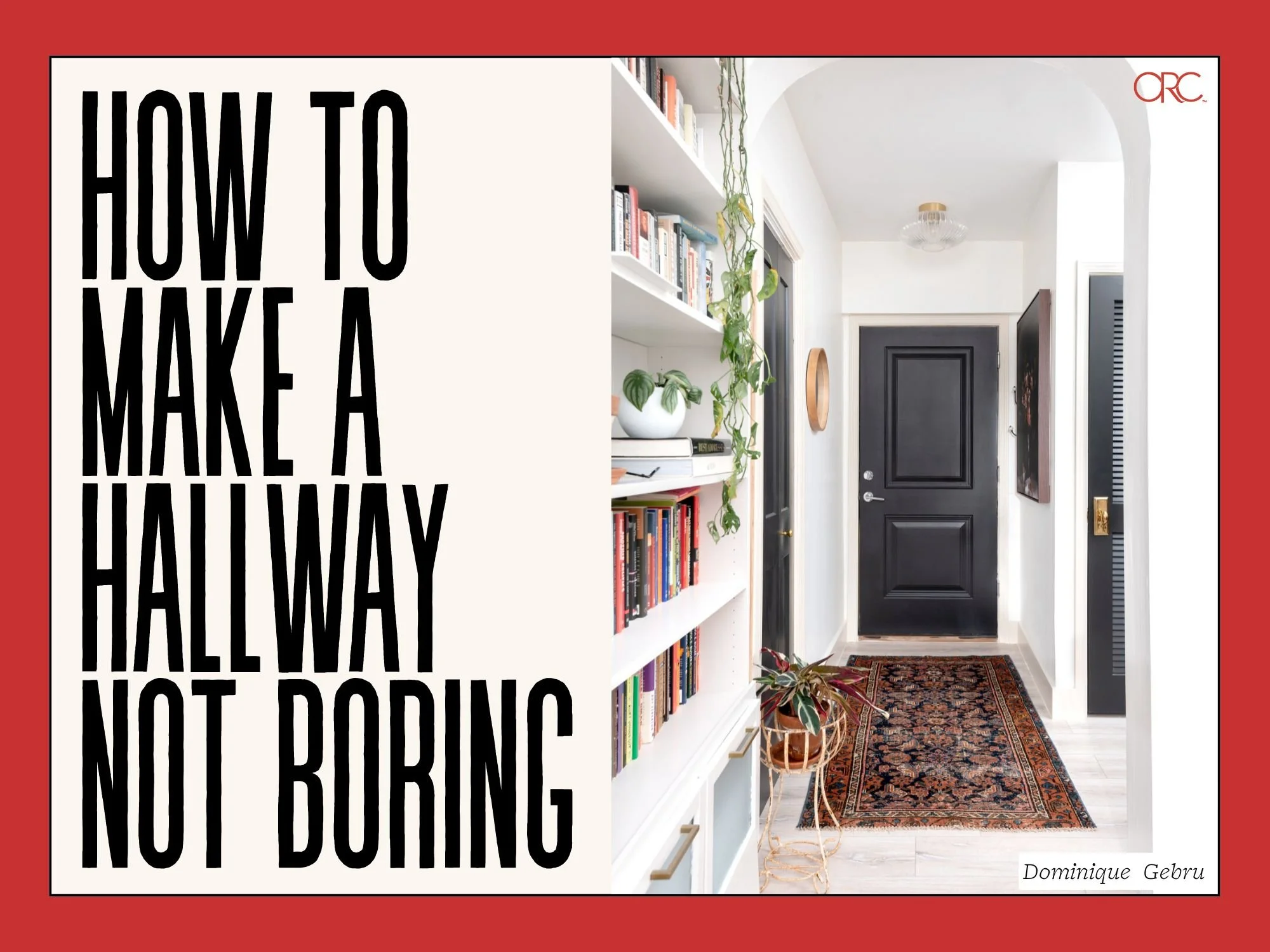
If your home has a bad case of “boring hallways,” fear not! There are so many ways you can make them feel just as special as every other room.
We were so excited to see so many community members interested in tackling mini projects. With help from ORC folks on Instagram, we’ve put together this mini project guide that should answer any questions and give you lots of ideas.
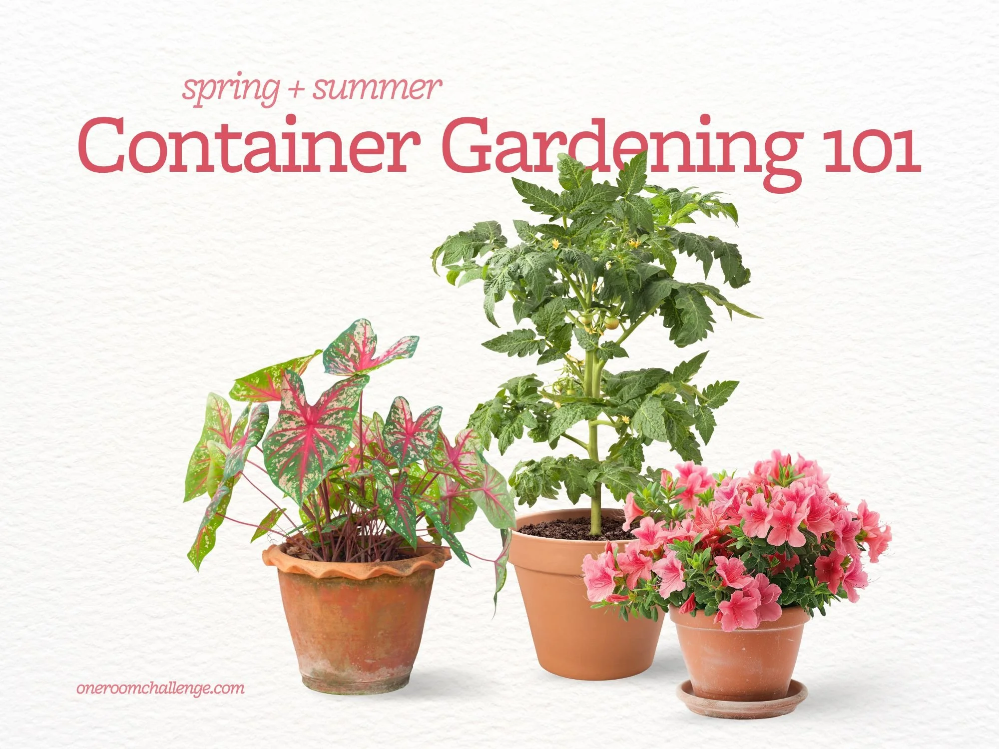
Think you don’t have space for a garden? Think again. Container gardening makes it possible to grow flowers, herbs, and even vegetables just about anywhere—balconies, patios, windowsills, or tucked into a corner of your yard.
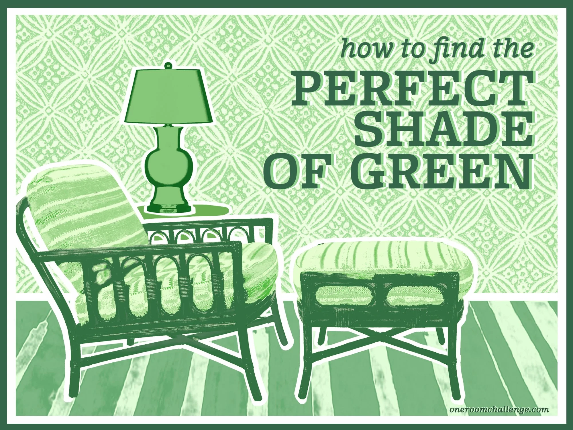
Looking to go green? Green continues to be one of the most versatile and beloved colors in interior design. There are so many gorgeous shades, though, that it can be difficult to know where to begin choosing the best green for your space.
Creating faux wallpaper with a stencil and paint is drastically cheaper than wallpaper, and it’s completely customizable. If your interest is piqued, here’s what to consider before you start.
Having an office space that energizes you and makes you feel inspired can be such a game changer.
Whether you prefer a bold space that excites you or a more neutral space that makes you feel calm and focused, there’s no better place to work than one that makes you happy.
As 2025 kicks off, our feeds have been wall-to-wall trend forecasts. The trend we’re rooting for the most this year, though, has been ongoing for years now, and has been embraced most widely by none other than Gen Z.
There’s no one-size-fits-all method for organizing your kitchen and pantry, but there is a right way, which is the way that works best for your daily cooking and cleaning routine.
Bathrooms, being small and functional spaces, have precious few ways to bring in pizazz.
Angela and Tyler transformed an 800-square-foot plot into a custom raised-bed garden. The whole project was quite an ambitious DIY undertaking that had us truly running to take notes.
Olaniyi and her husband tackled bringing fresh style and functionality to this space completely DIY, and the finished project has to be a contender for the world’s swankiest basement.

