How to Pull off the Eclectic Design Aesthetic
DESIGN
STORY BY VIRGINIA BESHEARS
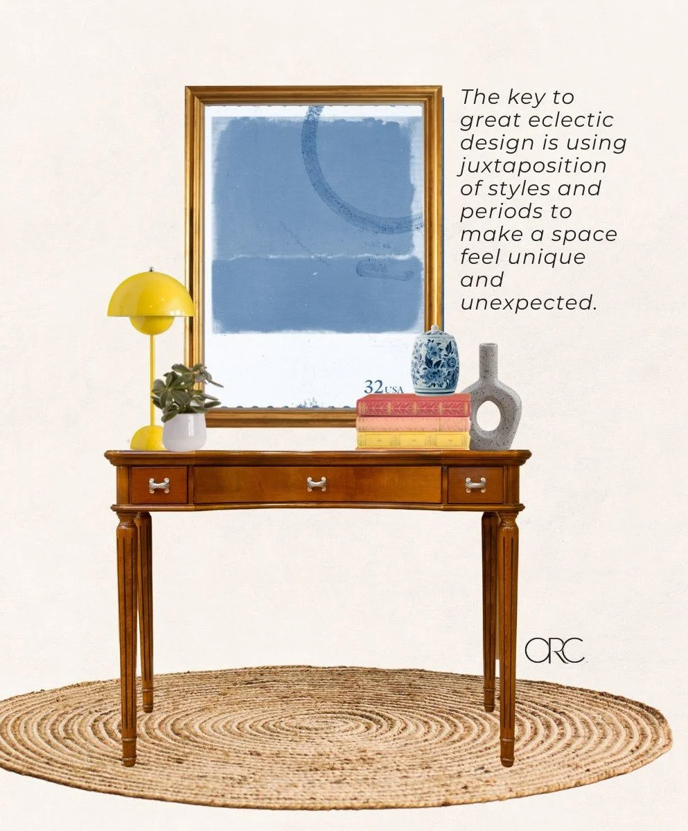
“Eclectic design” refers to the practice of mixing elements from different design eras and styles. That’s a bit broad, to say the least. Eclectic rooms are a feast for the eyes, but the style can be hard to pin down and master simply because of how expansive it is.
Good eclectic design is more than just mixing lots of elements.
The best eclectic spaces feel surprising and remarkable due to the juxtaposition of eras and styles. They maintain a sense of unity and coherence and showcase the breadth of the designer’s taste.
Below are examples of eclectic design perfection in past ORC rooms, plus tips and ideas for bringing the eclectic look to your space.
VIA THE PINK PAGODA
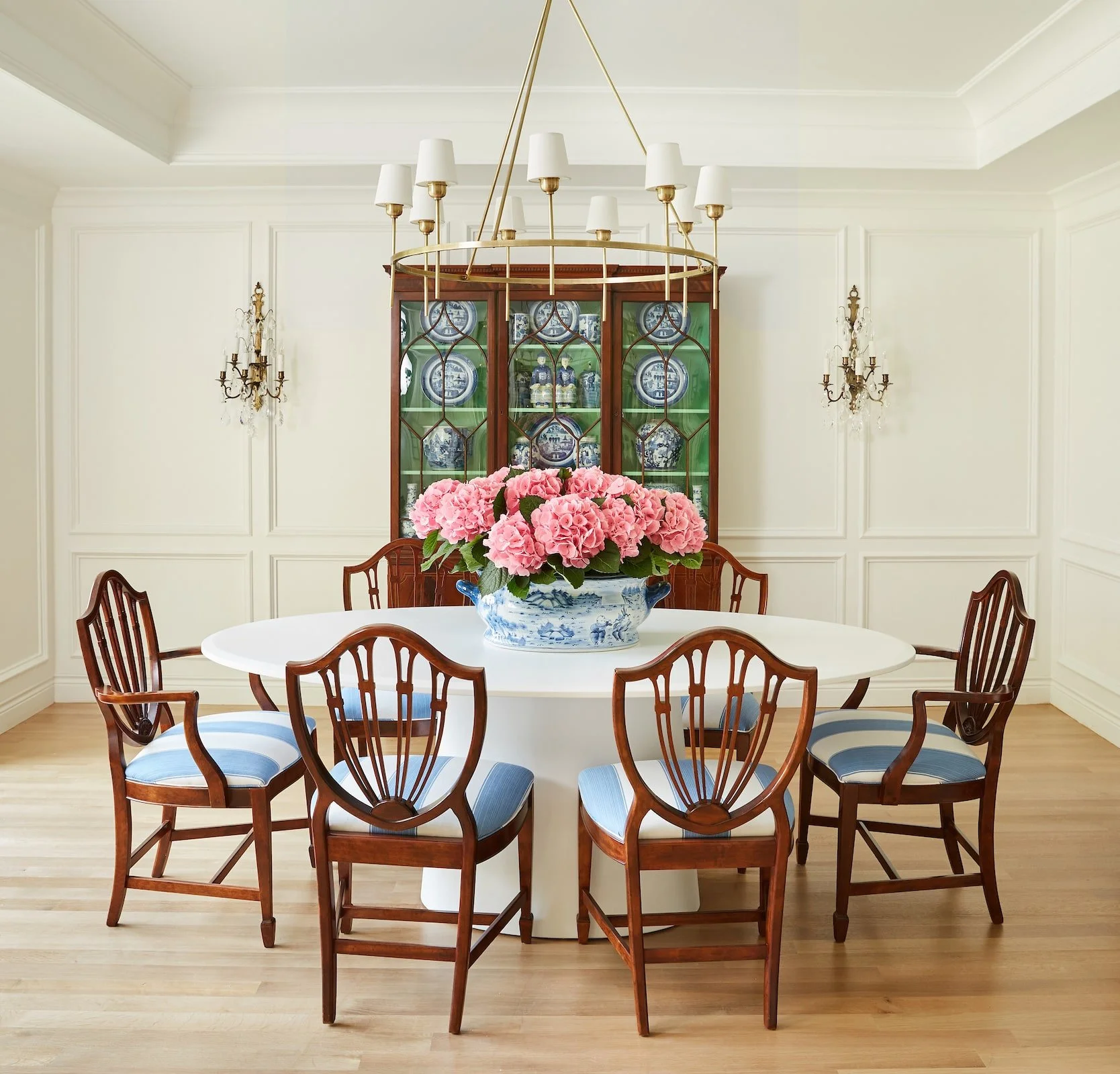
This gorgeous dining room by Jennifer of The Pink Pagoda is [boot camp] for understanding what makes eclectic design so captivating. The juxtaposition of styles could not be more obvious here. The federal style shield back dining chairs and the very modern pedestal table look so striking and exciting paired together because, aesthetically, they could not be more different. The other contrasting elements in the room like the traditional China cabinet and the contemporary light fixture add balance, and ultimately nothing in the room looks random or out of place.
So, how do you make sure elements from different styles will look ok together?
One way is to use accessories and smaller elements strategically so that your main elements won’t look random or out of place.
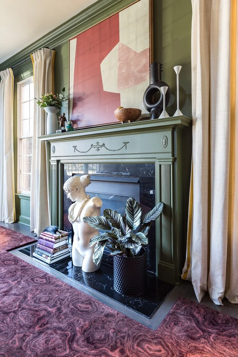
Check out how beautifully balanced the contrasting elements are in this space by Jewel Marlow. The two main contrasting elements are the large-scale abstract art and the ornate federal mantle. Smaller elements like the sculptural vases and the marble bust (whose necklace is a wonderful touch) create cohesion.
It looks completely unique and effortlessly cool.
VIA JANA DONOHOE
The level of contrast in an eclectic space can be more subtle, too. Pairing elements that are more similar in style or era will create a less striking effect that still feels whimsical and collected. This beautiful breakfast nook by Jana Donohoe is a great example of that. […]
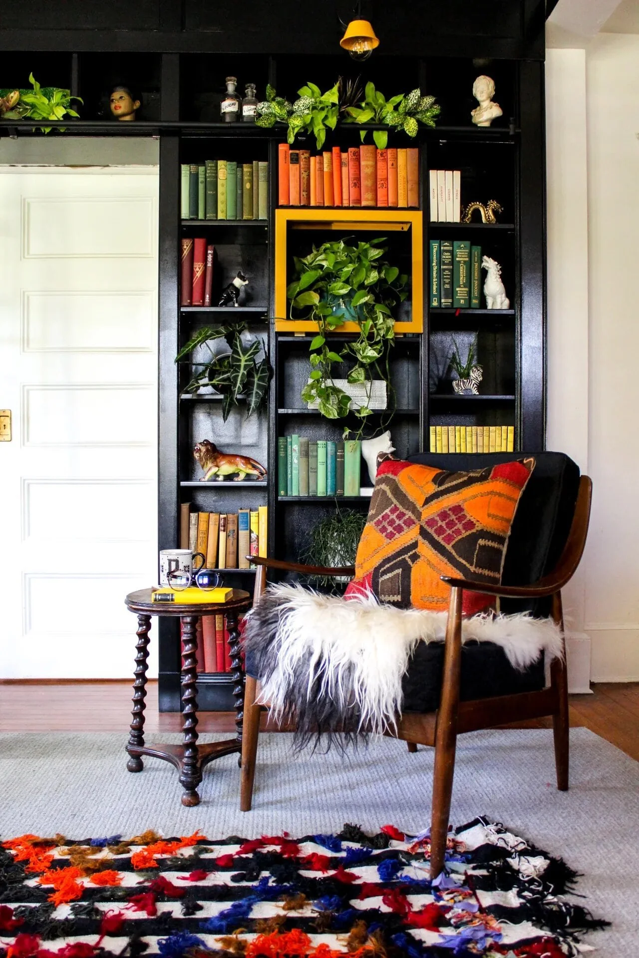
This incredible moody library is by Kate Pearce Vintage.
The bookshelf styling is a work of art. Ultimately, the best accessories will always be the ones that make you happy, because that’s what will infuse your space with personality and make it unique.
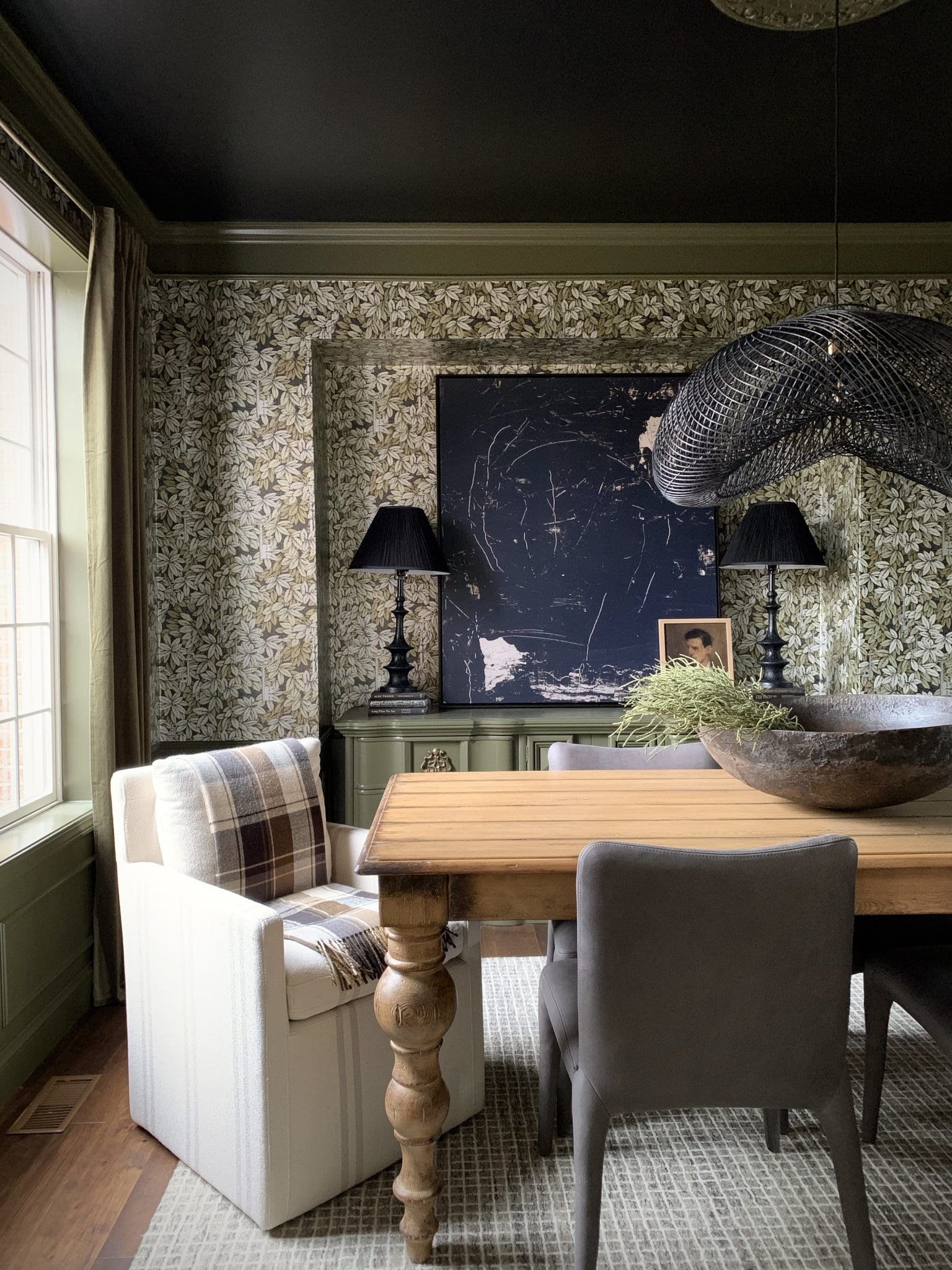
The real stars of the show, though, [are the little ornate stool/table and the Easy Chair-esque mid century modern armchair. On first glance, they’re both wood and full of vintage charm. On second glance, though, the contrast between the aged and the modern shines through and makes the space feel rich and dynamic.
As you can see, there really is no one right way to do eclectic design. It all comes down to what you love, what your favorite styles or eras are, and how you want to pair them.
If you love the eclectic look but don’t know where to begin, there are plenty of ways to go about starting. You could try doing some research on furniture styles (the more specific, the better, like art nouveau, federalist, arts and crafts, revival, and mid-century modern) to narrow down which styles you’d most love to pair. Or, you could go straight to online shopping (don’t forget about Facebook Marketplace!) to find a few statement pieces that can be the foundation of your room. Once you’ve figured out your main elements, you can try hitting up thrift stores for accessories that’ll create balance and cohesion.
Finally, don't be afraid to experiment. The best way to find your own eclectic style is to experiment. Try different things and see what works for you. There are no rules, so have fun with it!
